WHEN ONE IS MORE THAN ENOUGH
MONOCHROME BASICS: LETTING ONE COLOUR LEAD
In a world where one colour dominates, our Alta Plains offer ultra-matte textures on top of solid plain colours for an extra touch of class on top of timeless style.
Can you imagine yourself living in a world that’s only black and white?
Would you dress your work space with the same colours as your resting space?
Imagine spending every day in a space where each room is defined by one single colour.
Does it add to your general comfort when space and decors do not demand for your immediate attention?
Contrary to common belief, designing any living space with one base highlight doesn’t necessarily mean that your living space is uninteresting or uncreative.
As much as it takes to design beautiful contrasts with an assorted palette, it takes equal effort to play with less, and we hope that this blog will be helpful if you are considering to create a soothing and harmonious look without needing to fuss over having too many options.
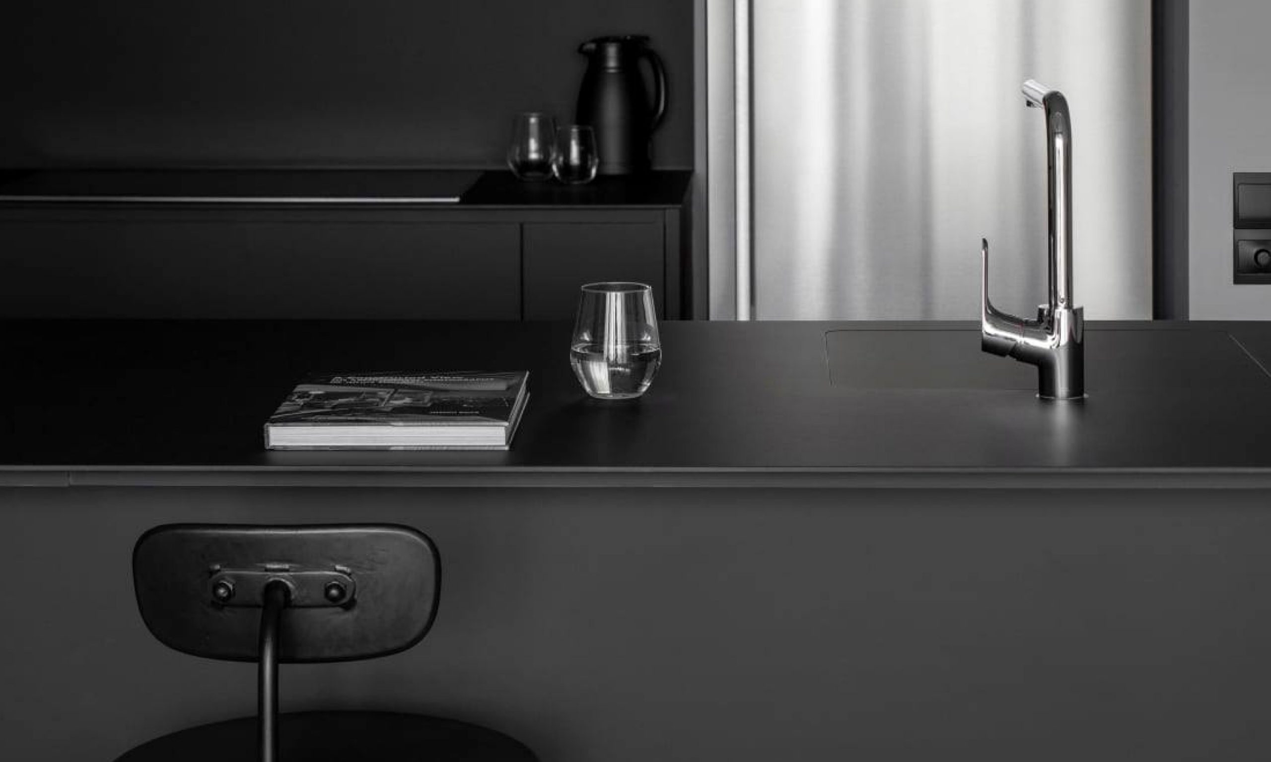
For those who prefer to spend as little time as you can on maintenance, maybe a monochromatic palette with dark contrast will suit you best.
Project by @authorsinstyle
KompacTop as Kitchen Countertop + Backer | K8.04 Grande Black | Alta Plains Kollection
COLOUR TIP: Stick with ONE colour as your base before expanding your palette to include various shades, tones or tints that originate from the same colour.
To avoid from straying too far away from your main colour, start by searching for basic colour guides to guide you through the process of building your monochromatic palette.
Generally, after choosing your preferred base colour, the rest of your palette can be found by adding various black, grey and white filters over the base.
Using the classic black-and-white combination as an example, the accompanying colours that build up this aesthetic combination would be a series of light and dark greys to create a visually cohesive look that can stay muted for long periods of time.
If you are the type that is easily distracted by your surroundings, this may be the perfect solution to help you stay focused regardless of time or day.
Check out the following moodboard for suggested colour combinations made easy with our award-winning colour Kollection.
With a compact profile of only 6mm-thick, our panels can practically hide in plain sight while offering durable surfaces that are effortlessly easy to maintain in the long run.
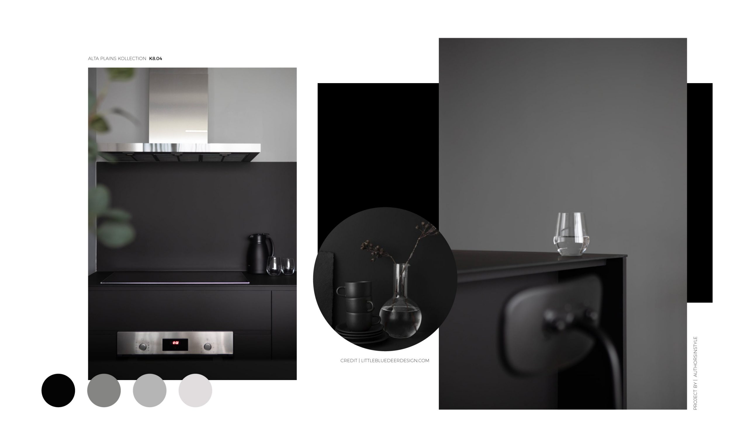
One thing’s for sure, our KompacPanels will be sure to help you achieve the sleek, modern look with its signature 6mm thickness.
STYLE TIP: Find your ideal ratio of base colour to supplementary colours to avoid overwhelming your space.
Once you’ve decided on your colour selection, we move on to identify which colours are to be used to separate main walls and furniture from the rest of the décors.
Using this as a visual guideline, we can control how light or dark the overall room can become, and that helps maintain the much-needed balance.
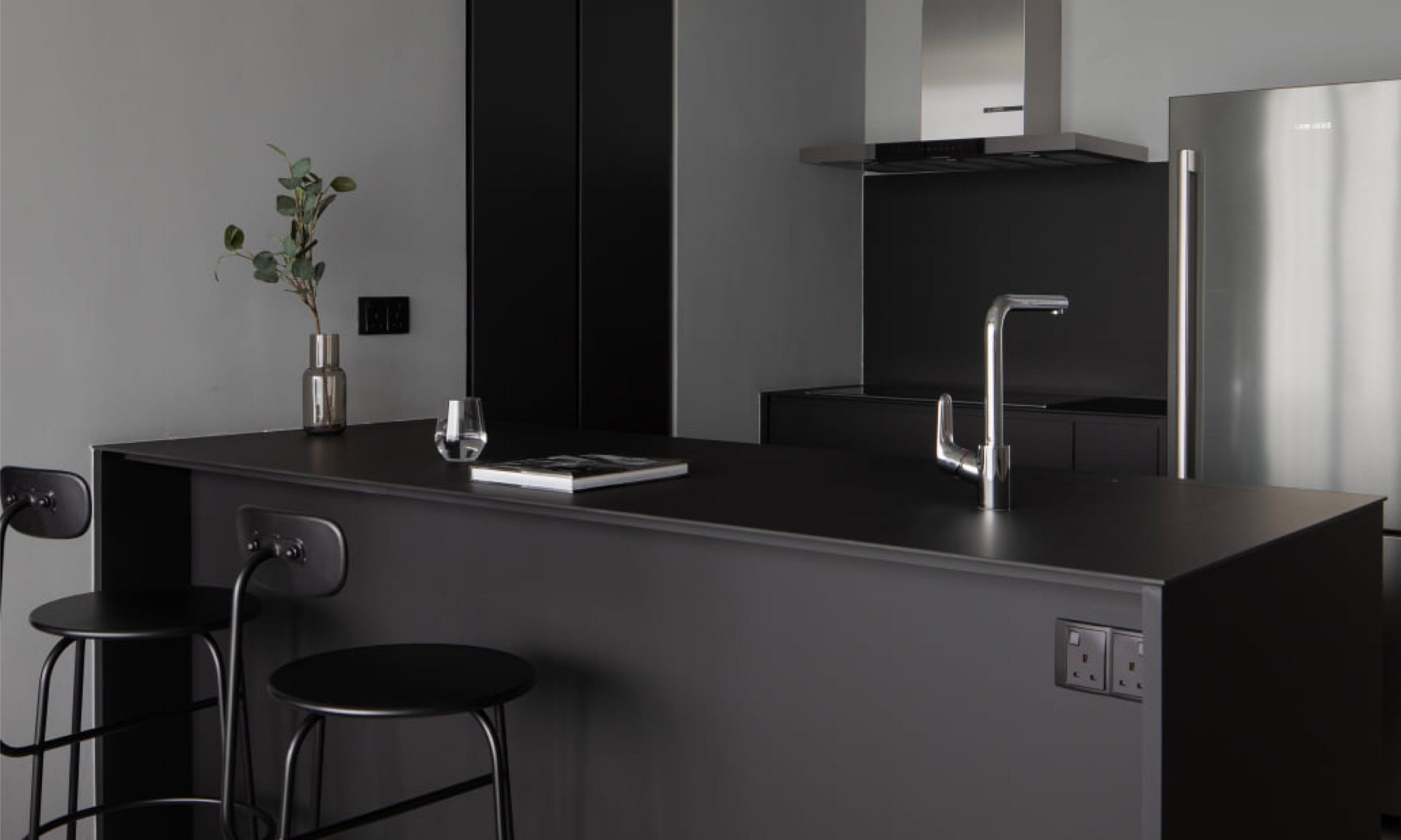
See how easily it is to identify which room you are in when it is dressed with a monochromatic palette?
Project by @authorsinstyle
KompacTop as Kitchen Countertop + Backer | K8.04 Grande Black | Alta Plains Kollection
With the right colour combination, this palette design can also easily make small room seem livelier and larger. Since the supplementary colours take up most of the palette offerings, it is easier to create the illusion of space and soften the primary edges in a room. For a breath of fresh air, white or black can be applied in specific areas to create white or blank space for us to rest our eyes.
Of course, just because this colour palette uses one origin of colour, it doesn’t mean that we cannot add further elements of interest to increase the aesthetic appeal of your living space.
We don’t even have to hold back on using different materials or texture. Try it out on throw cushions, accent furniture or rugs! For example, in a beige-themed bedroom, brown pillows with black stripes or shapes can be a pleasant addition that is functional at the same time.
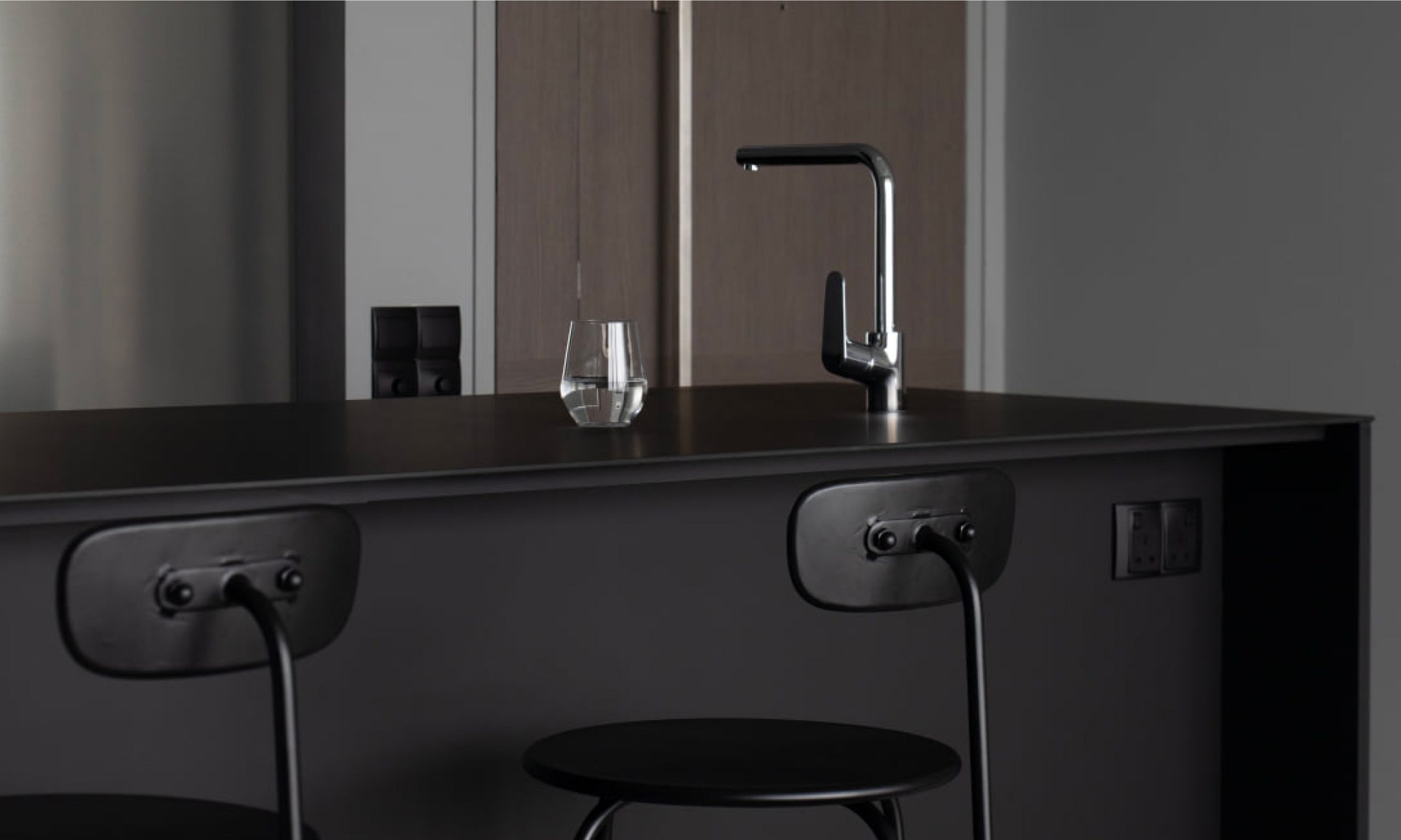
Modern homes nowadays are not afraid of letting black dominate like this kitchen space. Would you prefer to combine it with stainless steel grey like the fixtures in this kitchen space, or would you prefer it to be in brass or gold?
Project by @authorsinstyle
KompacTop as Kitchen Countertop + Backer | K8.04 Grande Black | Alta Plains Kollection
KEY TAKEAWAY: To maintain the cohesive look from one space to another, consider dressing the main element of each room in the same shade or colour.
The main reason why a monochromatic palette looks easy on the eyes is because the use of colour actually gives our brain an easier time in identifying patterns.
When moving from the living room where the majority of the furniture is white, a white bedframe or white kitchen cabinets will be the visual element that our brain will be expecting to find when we step into the cooking or sleeping space.
In the big picture, this colour arrangement promotes harmony, and when the aesthetic ratio is applied right, the connection from one room to another is streamlined to naturally tie the entire house together.
Rather than just pairing colours that visually looks nice, this design concept is built on the intention so that the purpose of each room can stand out in colour.
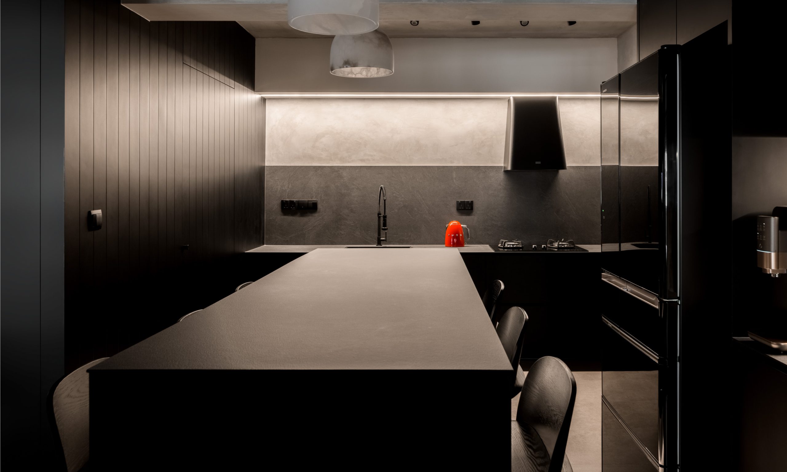
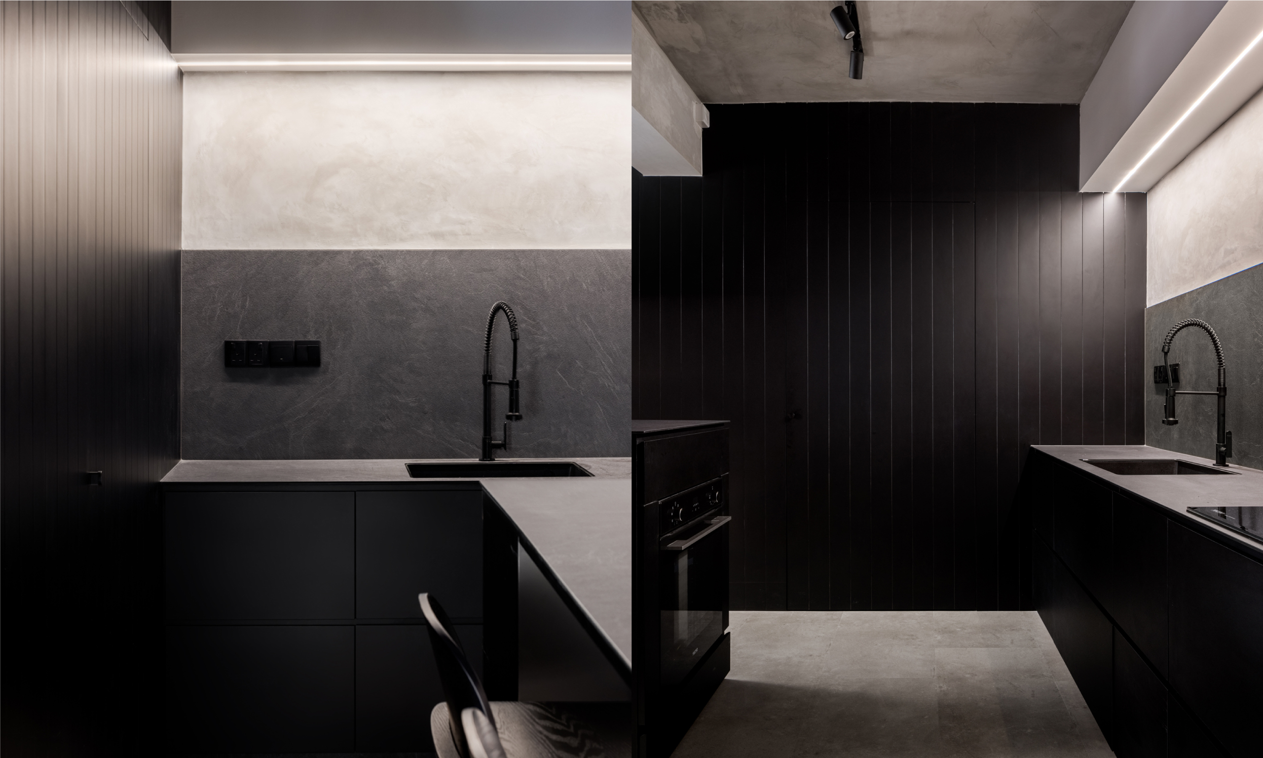
Surrounded by black walls and electrical appliances in the same shade, grey stone is an amazing complement that adds contrast and soft character to an otherwise bold and cold palette.
Project by @thelocalinnterior
KompacTop as Kitchen Countertop + Backer | K3.09 Linate Slate | Patterns Kollection
Which colour(s) would you prefer to build a monochromatic kitchen space?
Custom-matched with award-wining textured finishings, our KompacPanels are available in 32 nature-inspired colours that are designed for long-term practical use with added aesthetic appeal that is equally effortless to maintain.
Start your new interior chapter with us by browsing through our full Kollection here.
For colour recommendations, reach out to us at 60 012-5882258 or write in to enquiry@kompacplus.com.my. More inspiring references on how your space can turn out with KompacPlus can be found on Facebook, Instagram and Pinterest!
Comments are closed.

