THE SHAPES THAT MATTER
INTERIOR OF THE MONTH: PATTERN PLAY
Every living space is essentially a collection of your favourite shapes and colours.
Take a good look at your surrounding:
Do you see mostly squares or circles?
Beyond shades and texture, every room is fundamentally a collection of shapes in assorted sizes. From architecture to décor, every element contributes to the final picture that we come to recognise as home for all live, work, and play. These details are essentially what makes our spaces different from yours; even if we are using the same colour palette that’s currently in trend.
Where we’ve touched on the beauty of curves in last month’s blog entry, we hope that this one helps you understand how different shapes work to complete your interior space. Let’s start by comparing these two spaces below:
Which looks better: Round or square windows?
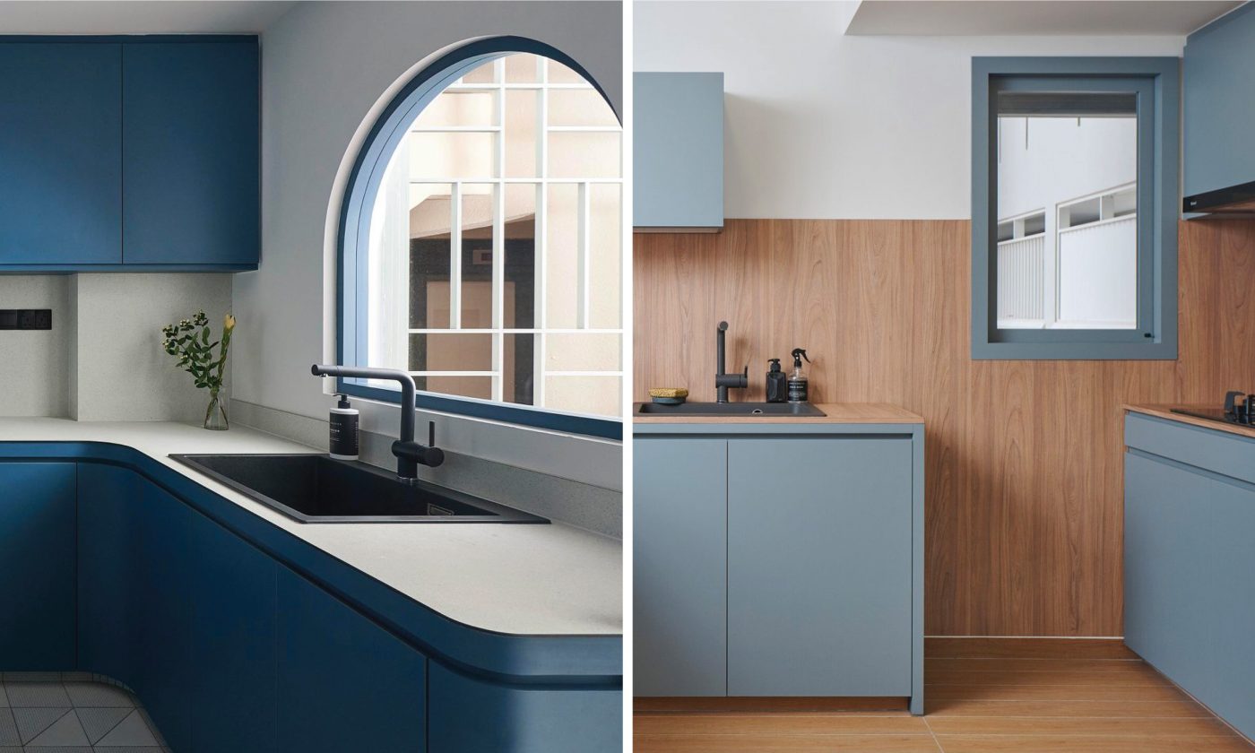
Project by @studiofortyfoursingapore
KompacTop as Kitchen Countertop + KompacWall as Kitchen Backer
Classic Origins: Circles and Squares
Where spaces nowadays are generally designed with a rectangular layout to enhance its spaciousness, squares are the common shapes we find in doors, windows, and even floor tiles that complete the setting of a basic room.
While there is no rule stating whether curves or sharp corners are more superior, squares naturally represent order and uniformity while circles convey movement with a natural softness. However, because our minds are wired to recognise patterns in the big picture, any shape other than squares are bound to stand out and grab our attention, regardless of size and colour.
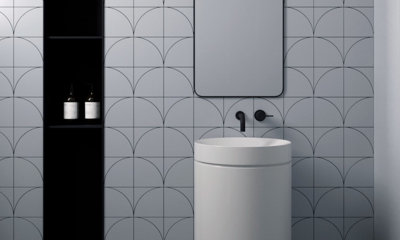
What about engraving fish scales to complement a bathing space instead of square tiles?
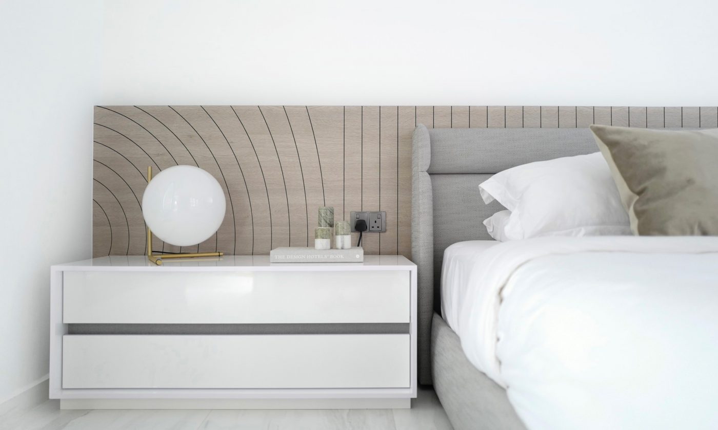
Gentle curves on the headboard adds a comforting zen feel to this bedroom space.
Project by @weestudiosg
KompacTop as Bed Headboard
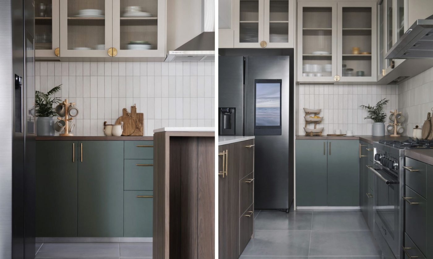
The gridded kitchen backer made of long, rectangular tiles naturally gives us a sense of comfort with its organised neatness.
Project by @keyconceptsg
KompacTop as Kitchen Countertop + Downturn | K2.08 Sicily Dark Walnut | Woods Kollection
Creating new perspectives with pattern-ful fun
Designed and built with signature 6 mm thickness, the surfaces of our KompacPanels can be customised to become more than just countertops and bathroom vanities.
Launched in 2019, our KompacPlay collection is a series of accessories that offer both function and aesthetic style that complements well with any interior theme. Using advanced technology, your favourite designs can be engraved on the panel surface to feature the black panel core as the focal point of feature walls, table coasters, and more.
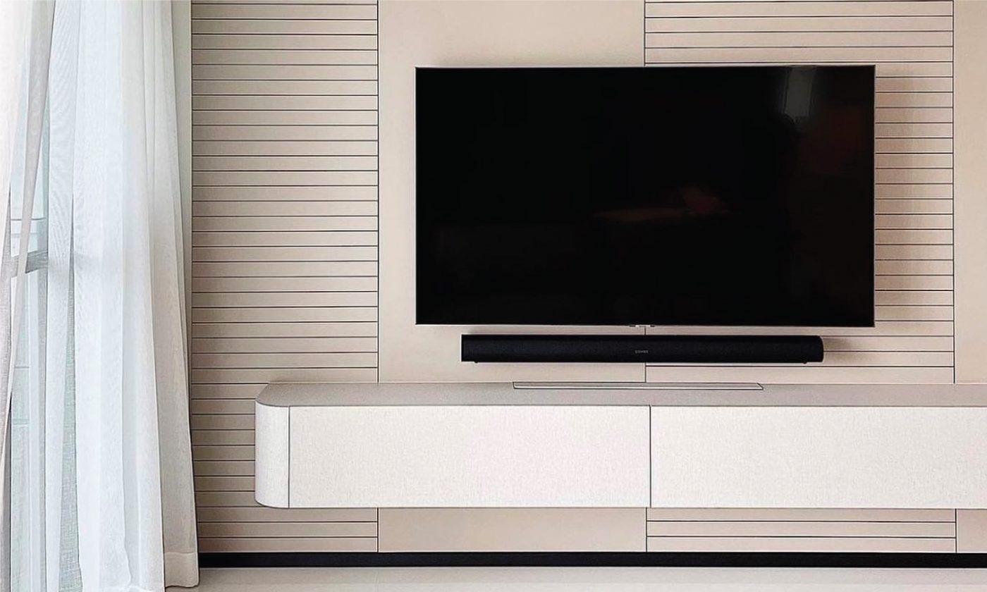
As an alternative to pretty wallpapers and decorated shelvings, the KompacPlay Engraving feature is a popular add-on to enhance the appeal of minimalist spaces.
Project by @weestudiosg
KompacWall as Wall Feature with Engraving | K1.03 Lazio Taupe | Plains Kollection
With 20 standard designs to choose from, our KompacPlay Sink Covers are custom-made accessories designed to enhance kitchen efficiency with added work space whenever you need. Tailored for seamless applications with matching KompacTop countertops, these multi-purpose lids offer both purpose and visual appeal in all 32 textured colours from our Kollection.
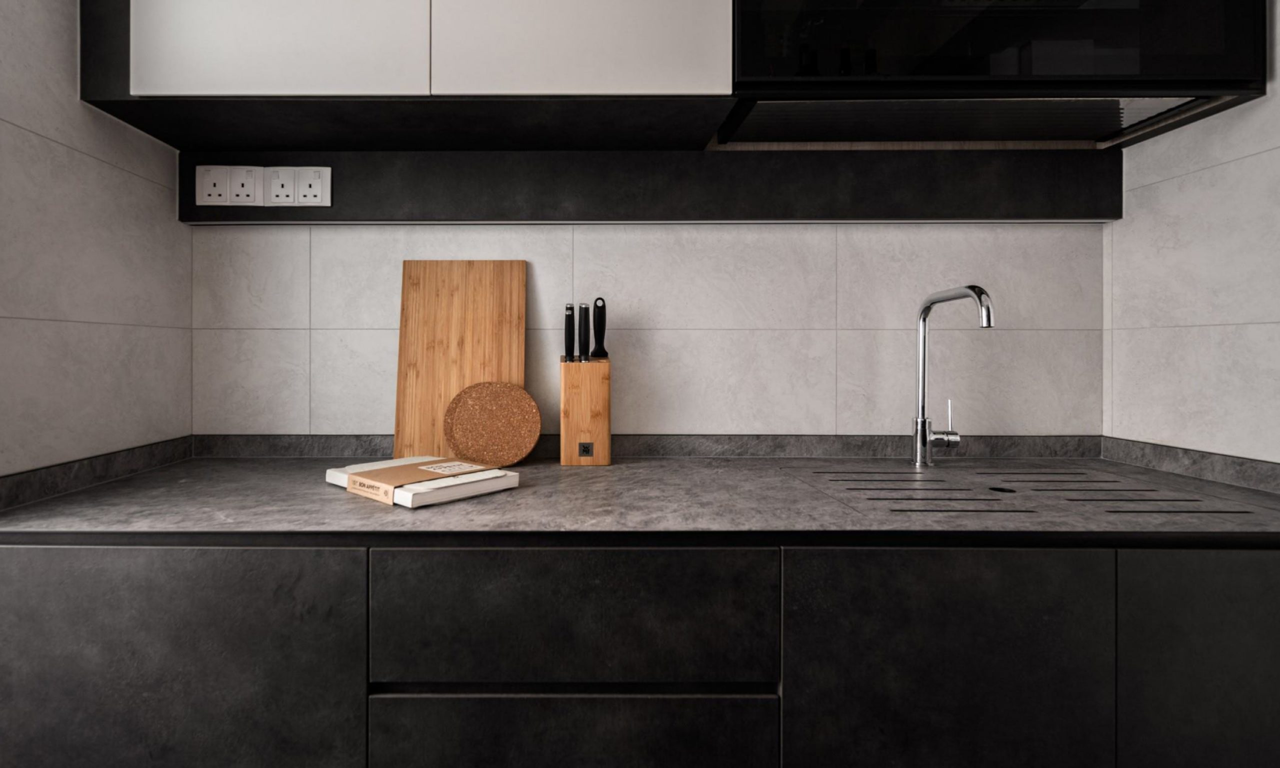
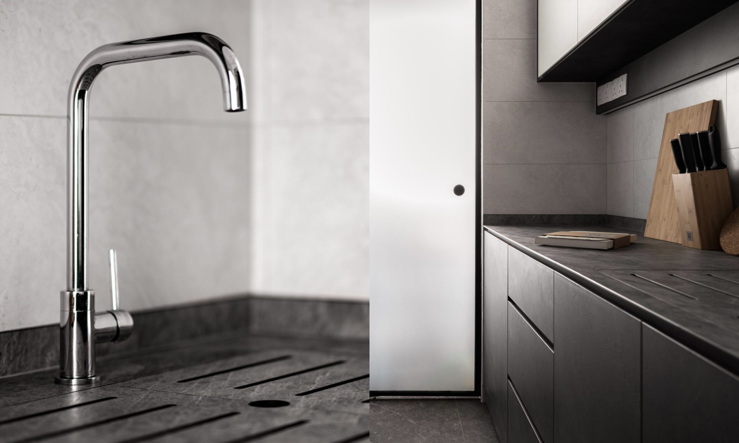
Customisable by shape, size, and colour to seamlessly match the adjoining countertop, our KompacPlay Sink Covers are designed to offer practicality as both added countertop space and kitchen accessory.
Project by @pgdesignco
KompacTop as Kitchen Countertop + KompacPlay Sink Cover | K3.03 Grigio Cardoso | Patterns Kollection
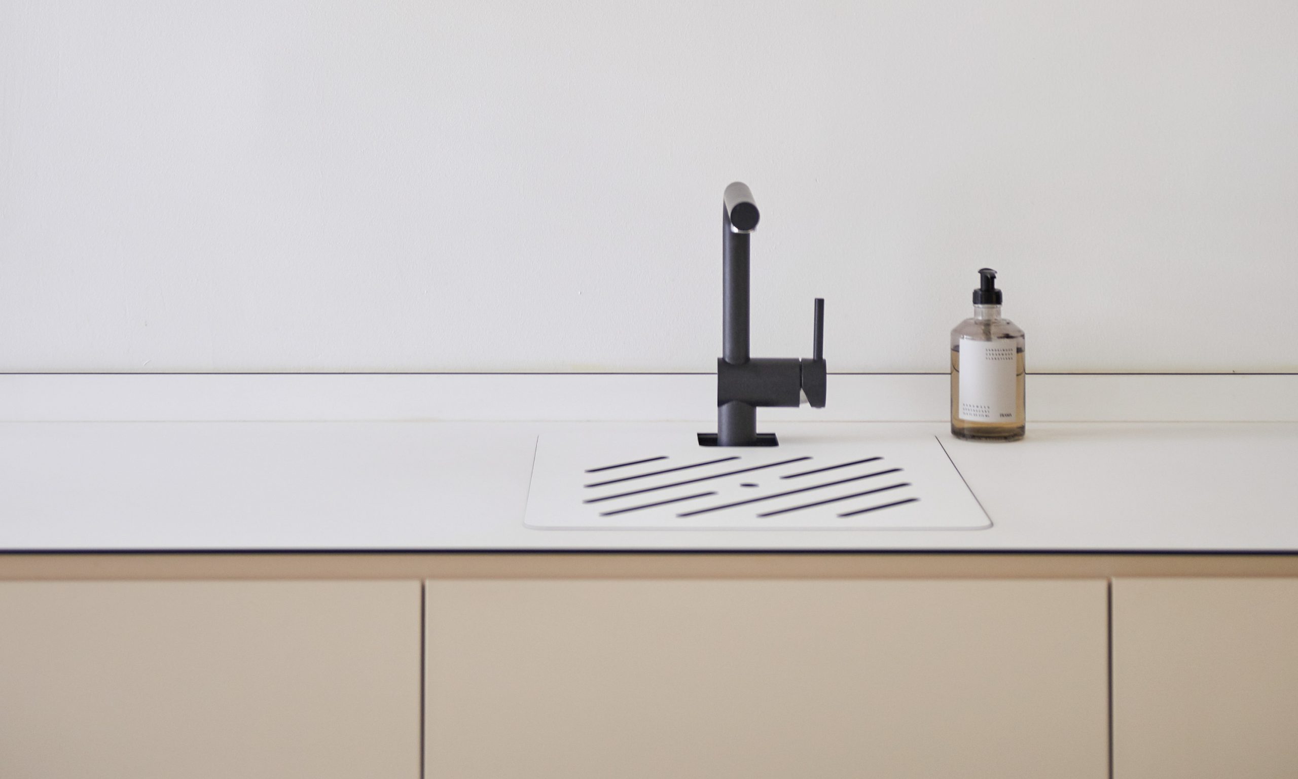
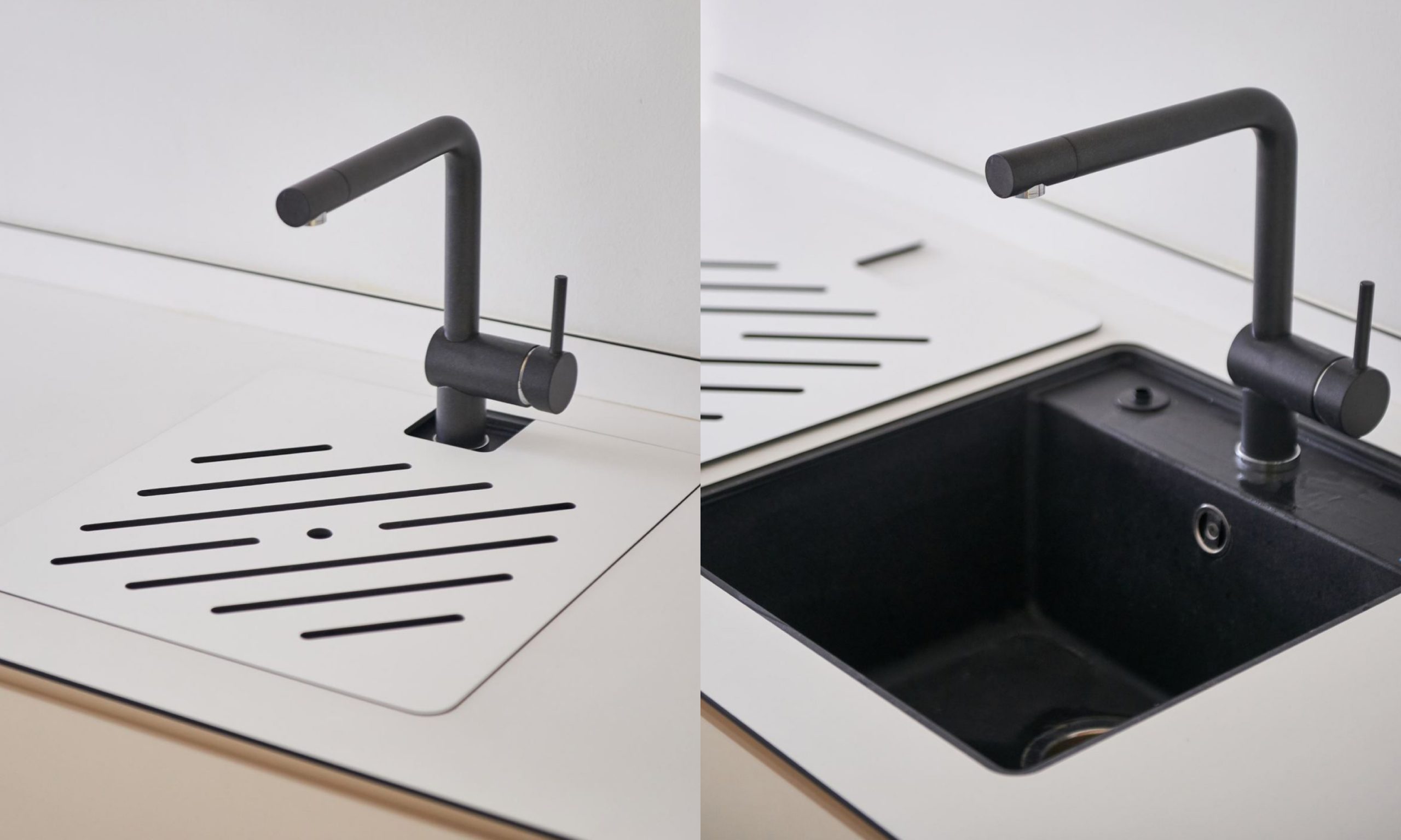
For solid-coloured interiors with clean, minimalist backgrounds, the carefully cut grooves on the sink cover lids feature the black panel core to add visual depth to the overall kitchen sink outlook.
Project by @studiofortyfoursingapore
KompacTop as Kitchen Countertop + Sink Cover | K8.01 Grande White | Alta Plains Kollection
If a beautiful contrast in colour is your deal-breaker, KompacPlay MixMatch is the perfect solution that offers both colour contrast and design freedom to merge two KompacPanel colours into one application. From feature walls to table tops to kitchen backers, what makes this application unique is the total freehand you’ll have to design your MixMatch surface.
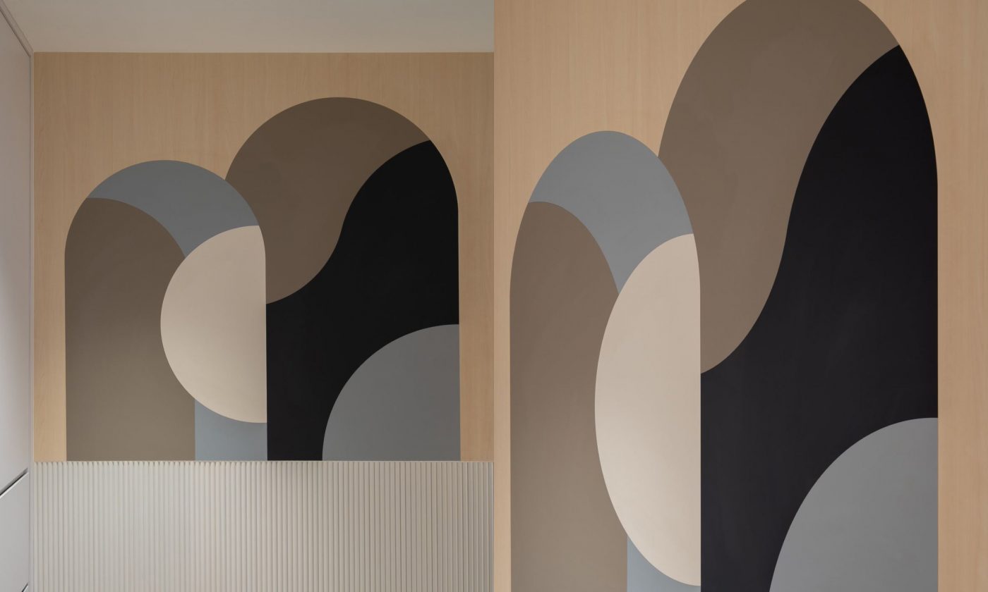
Where two colours are the minimum for every MixMatch combination, the possibilities are endless, as shown by this feature wall that showcases 5 of our Kollection colours in assorted solid and patterned colours.
Project by @arche.interior
KompacWall + KompacPlay MixMatch as Feature Wall | K2.03 Treviso Maple + K1.02 Naples Cream + K1.03 Lazio Taupe + K1.03 Cloud Grey + K1.05 Graphite Grey
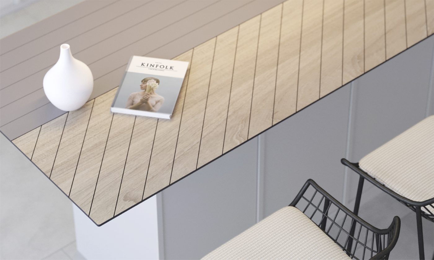
On top of every colour combination, MixMatch also allows further customisation with KompacPlay Engraving – perfect for minimalist interiors where decors are sparse.
KompacTop as kitchen island countertop | K1.03 Lazio Taupe | Plains Kollection + K2.01 Brescia Acacia | Woods Kollection
Fundamentally, shapes are a form of art.
Where interior trends are constantly shifting from traditional to modern contemporary, shapes will always remain as the basic elements of design that we will come back to build our space. Big or small, what matters is the way they are arranged to create a sense of symmetry and harmony that we ultimately recognise as our own brand of comfort.
Follow our brand journey by following us on Facebook and Instagram! For interior ideas and inspiration, look us up on TikTok, Pinterest and Youtube. Feel free to contact us at 6842-0335 or write-in to enquiry@kompacplus.com.my for further assistance from our friendly representatives!
Comments are closed.


