CREATING A SOOTHING WELCOME
INTERIOR OF THE MONTH: COLOURS
More than just a way to style and attract, colours are essential for creating meaningful spaces that reflect one's unique personality.
When you walk into a space for the first time, what is the first thing that catches your eye?
Before we can get close enough to appreciate the finer details that set each space apart, colours are often the first thing that we notice and remember, aside from giant features of art and décor that are purposefully positioned to be in our line of sight.
In the case of closer spaces, specifically places where we live and work in, how our eyes will naturally look for the things that stand out, and in this blog, we aim to help you understand a few basic ways to turn simple spaces into rooms that inspire.
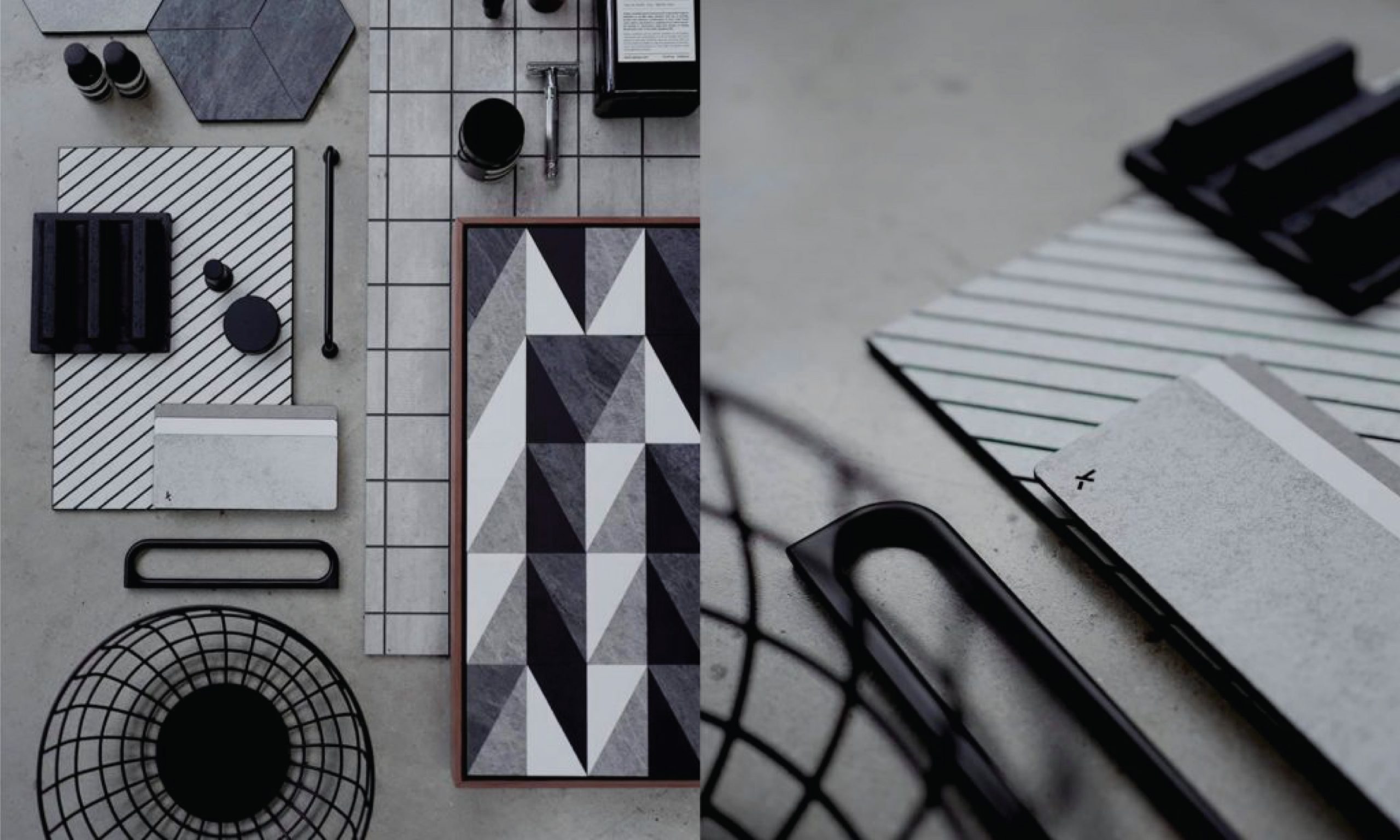
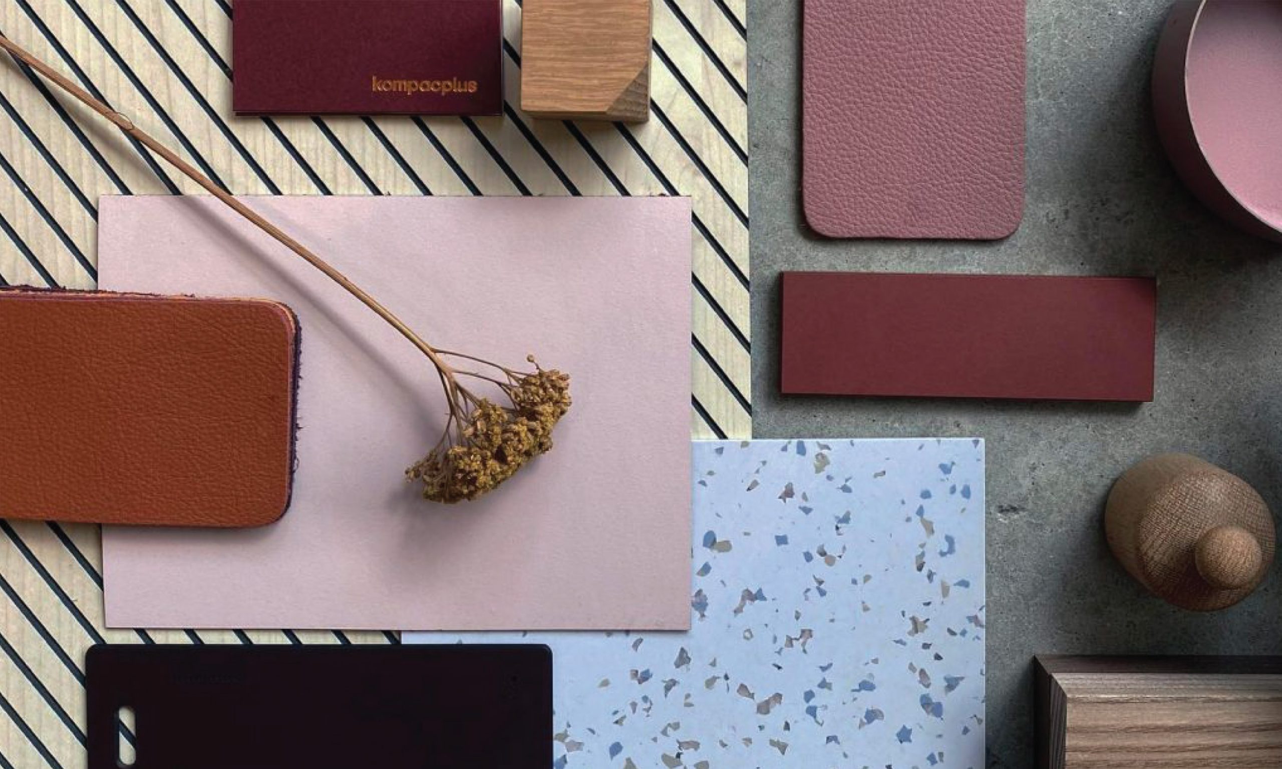
From countertop surfaces to cabinet fixtures, careful consideration must be given to every aspect in order to create a living space that looks as well as it can function.
Nothing lifts one’s mood better than bright pops of colour.
There’s a reason why bright colours are used for celebration, signs and symbols. Their rich shades can naturally grab attention and direct wandering eyes to where we want or need them to be.
The only trick when it comes to using bright shades is to avoid letting it overwhelm the space by pairing it either lighter or darker shades to create unique contrasts.
As accent walls, bright colours generally pump energy into the entire space. As furniture pieces, they work best to draw attention to the centre of any room. In any form, they effortlessly add bold character to your space; creating a lasting impression for visiting guests.
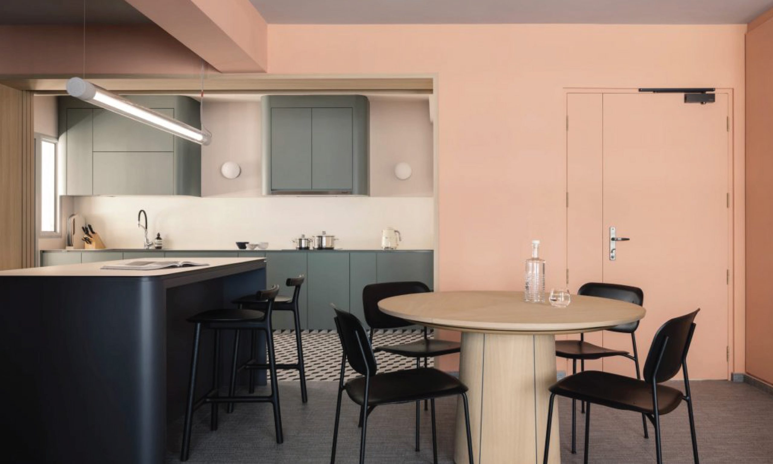
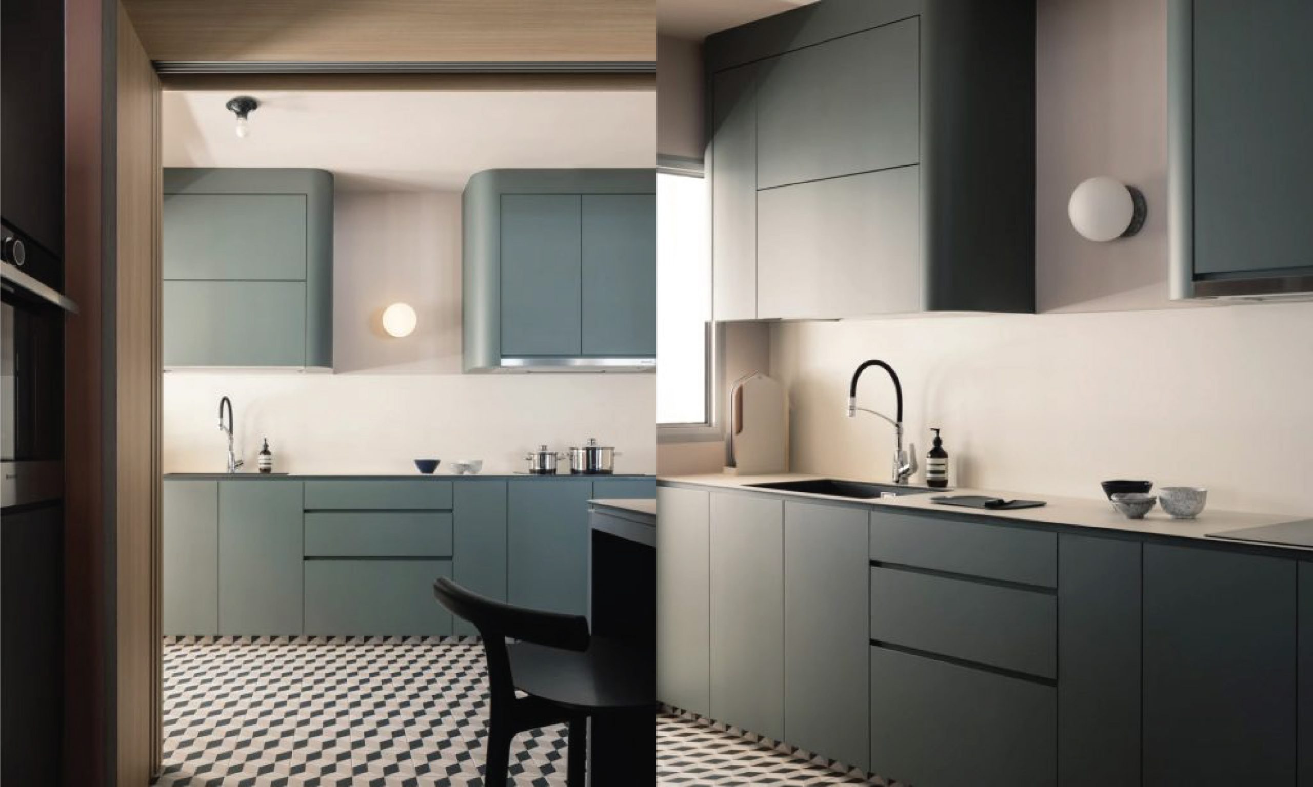
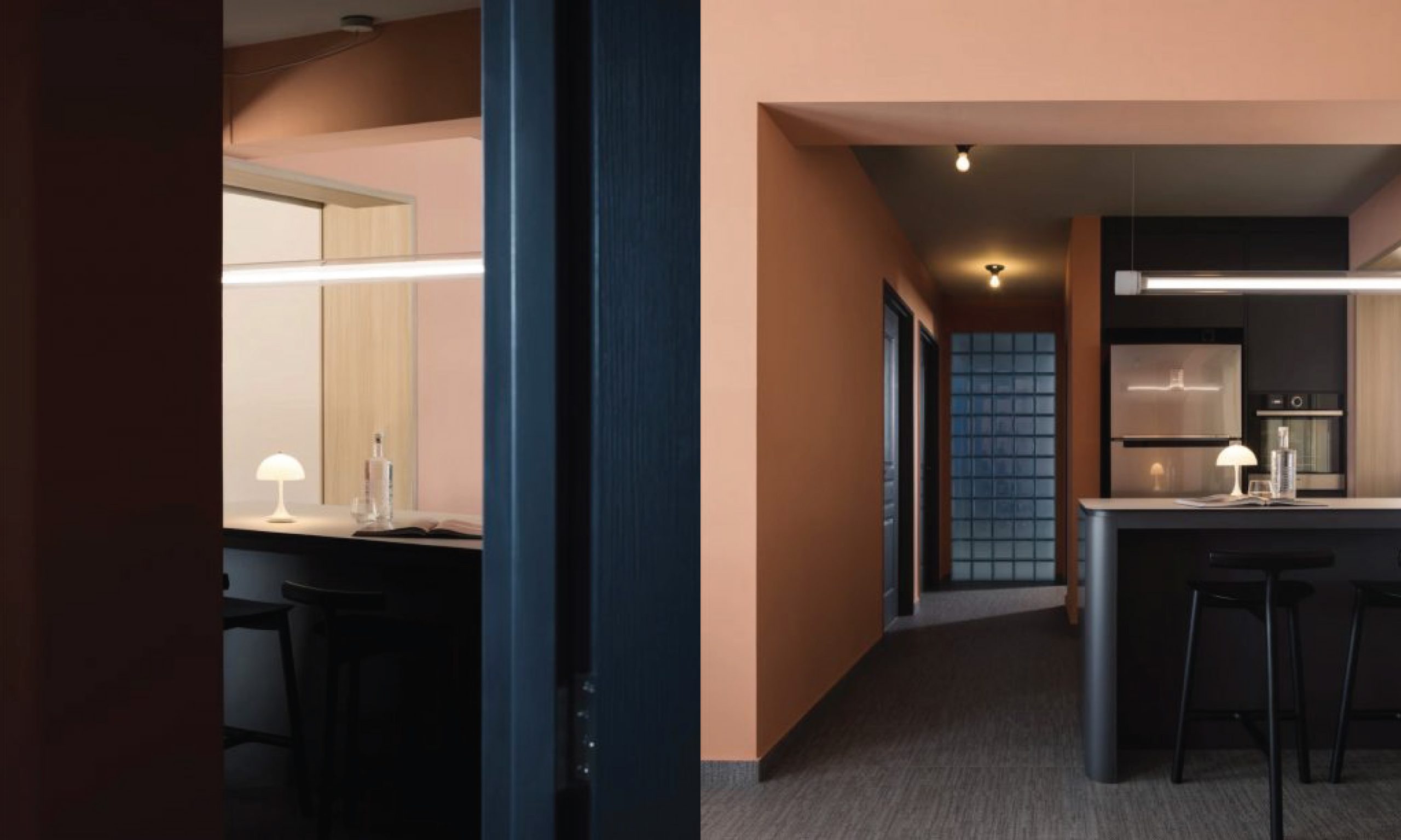
Paired with the right lighting, bright colours are great for creating warm spaces that are perfect for gatherings and lively conversations.
Project by @shed.studio
KompacTop as Kitchen Countertop + Backer | K1.02 Naples Cream | Plains Kollection
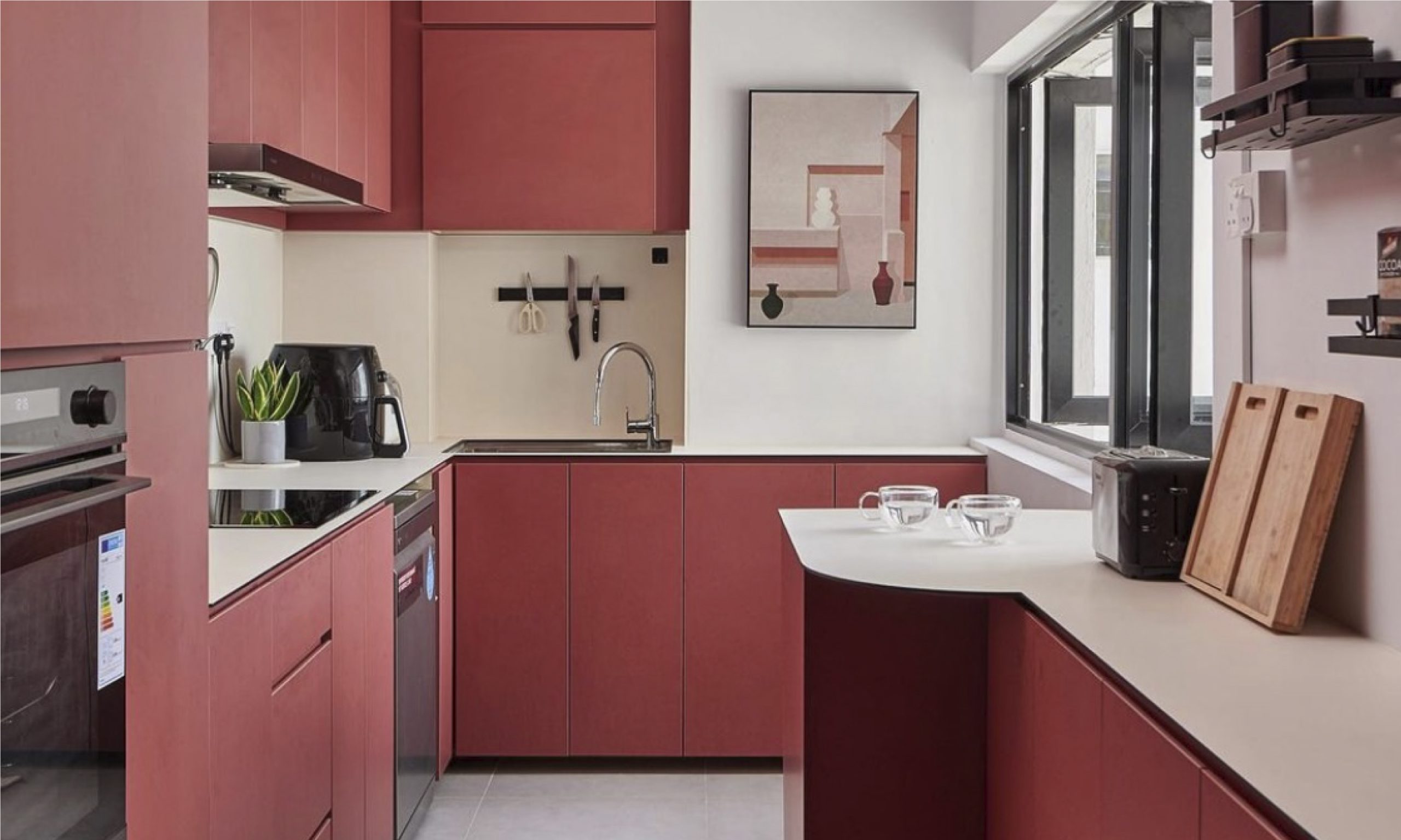
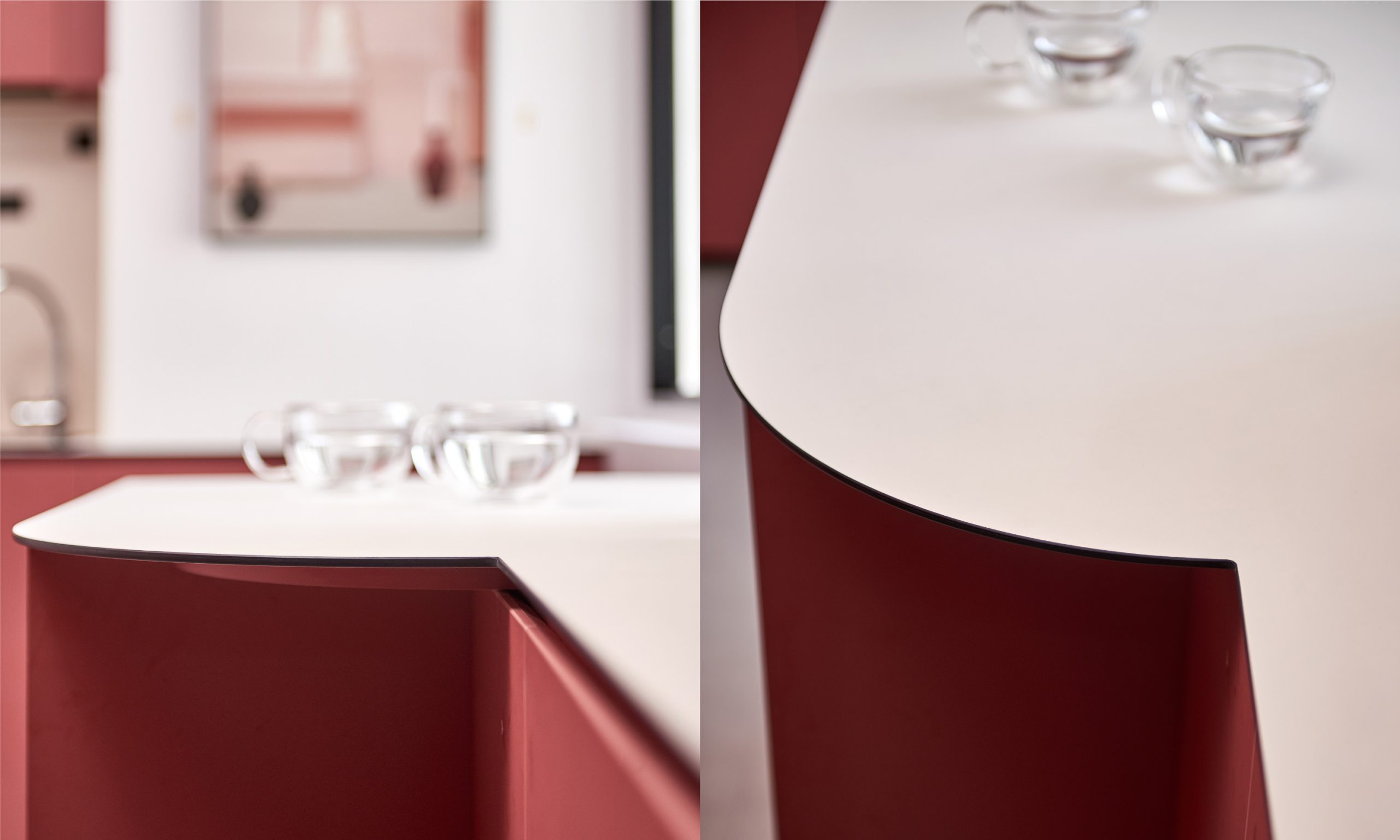
Consider matching a bright colour with neutral shades to avoid creating a living space that overwhelms you every time you walk into the room. We love how the richness of the red cabinetry is paired with white countertop surfaces to create a kitchen space that is bright, cheerful, and festive all year round.
Project by @eightytwo.sg
KompacTop as Kitchen Countertop + Backer | K1.01 Pure White | Plains Kollection
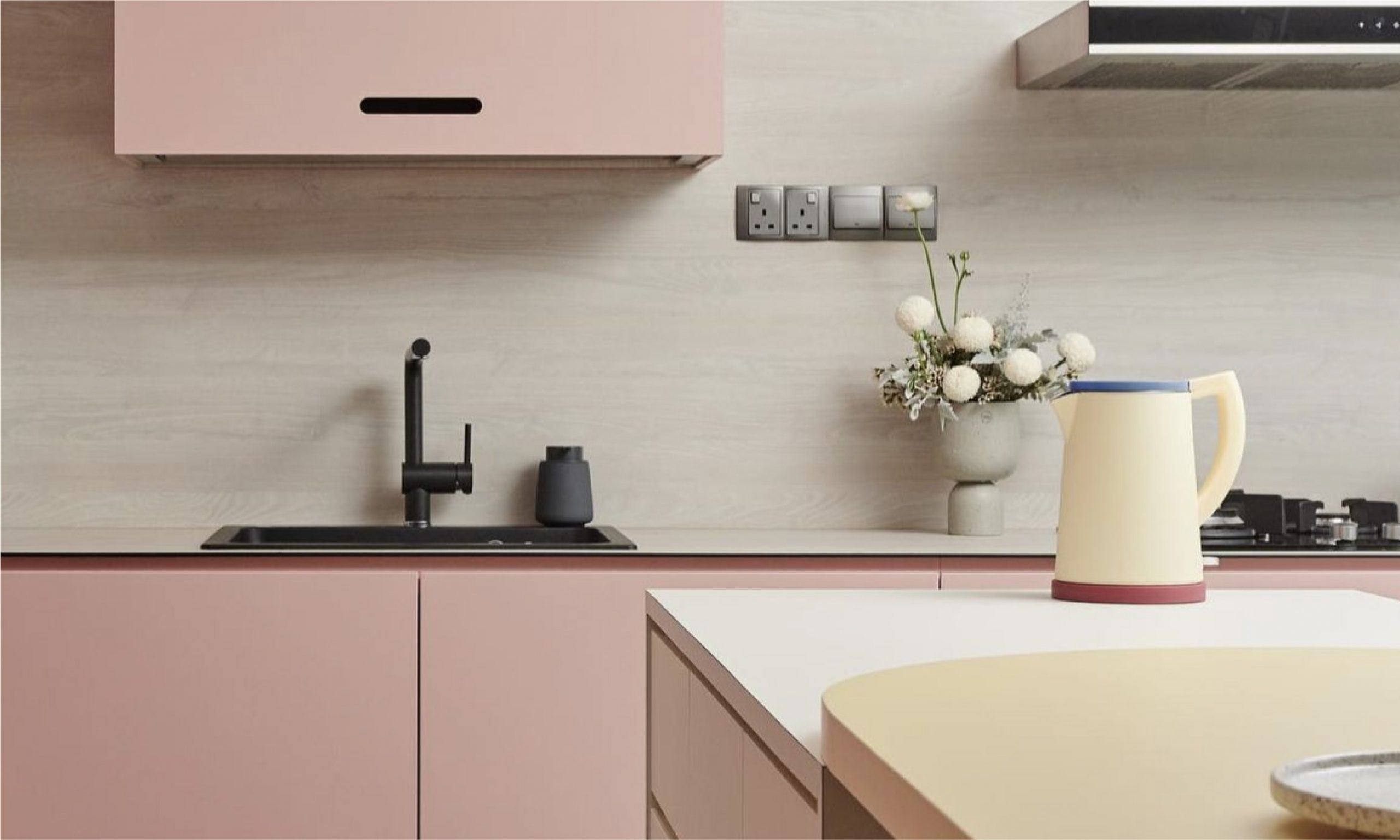
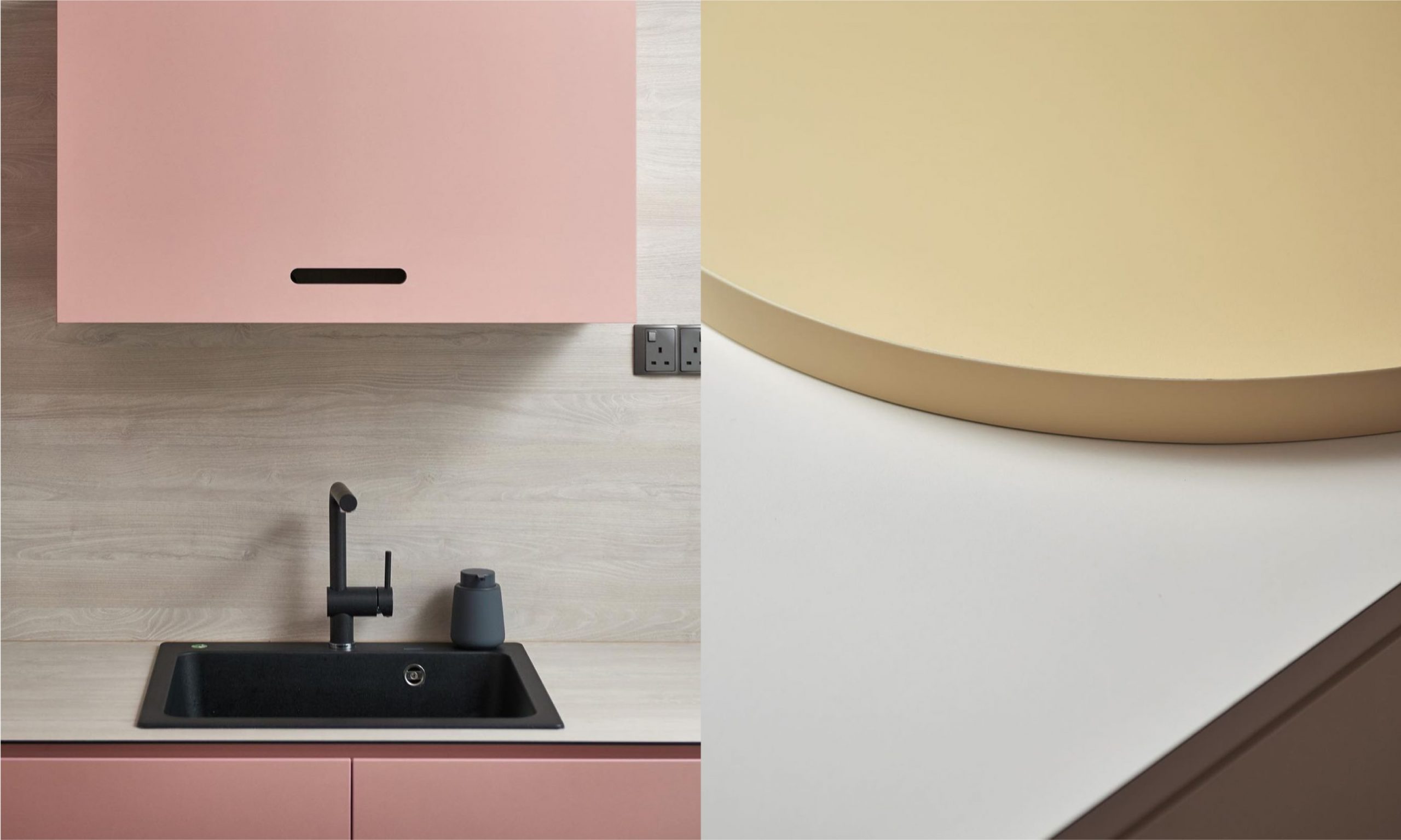
Paired with light woodgrains, pastels are largely popular as softer alternatives to create a bright and airy space that is equally warm and inviting.
Project by @studiofortyfoursingapore
KompacTop as Kitchen Countertop + Backer | K2.01 Brescia Acacia | Woods Kollection
Where simplicity rules, pattern-free solid colours offers a basic start to create soothing havens.
As modern trends go, a minimalist home remains as one of the top interior picks for those who favour carefree lifestyles with a limited yet neutral colour palette.
Primarily consisting of whites, browns, and greys, our Plains series offer 10 of these neutral colours that are available with either a standard matte or ultra-matte finish.
Paired with furnishings that require little effort to maintain over time, these spaces are set to serve and support without added distractions so that we can focus on getting what needs to be done for the day.
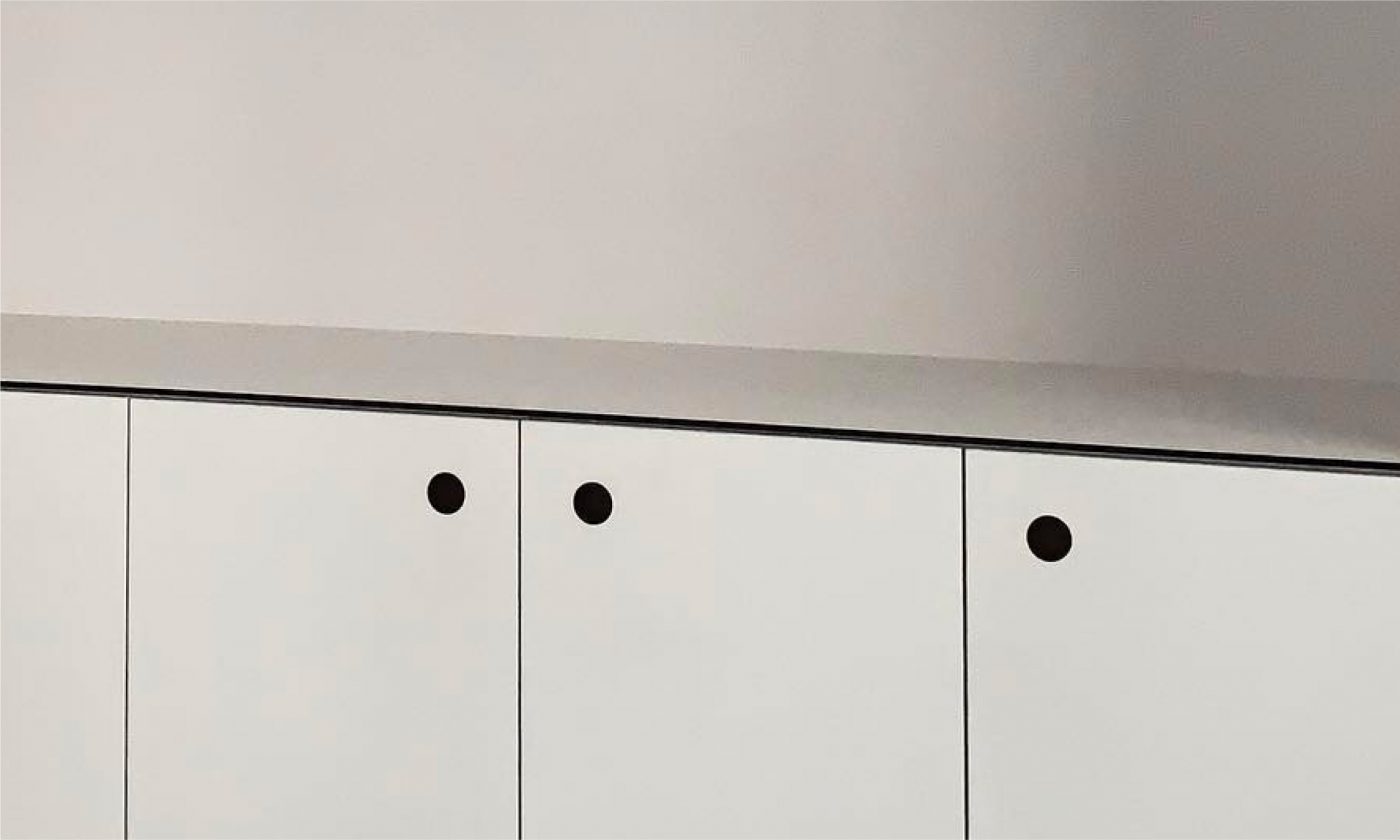
Since KompacPanels are only 6mm-thick, its distinct black-coloured panel core matches well with the rest of this pristine space.
Project by @_kurokagi_
KompacTop as Kitchen Countertop | K8.01 Grande White | Alta Plains Kollection
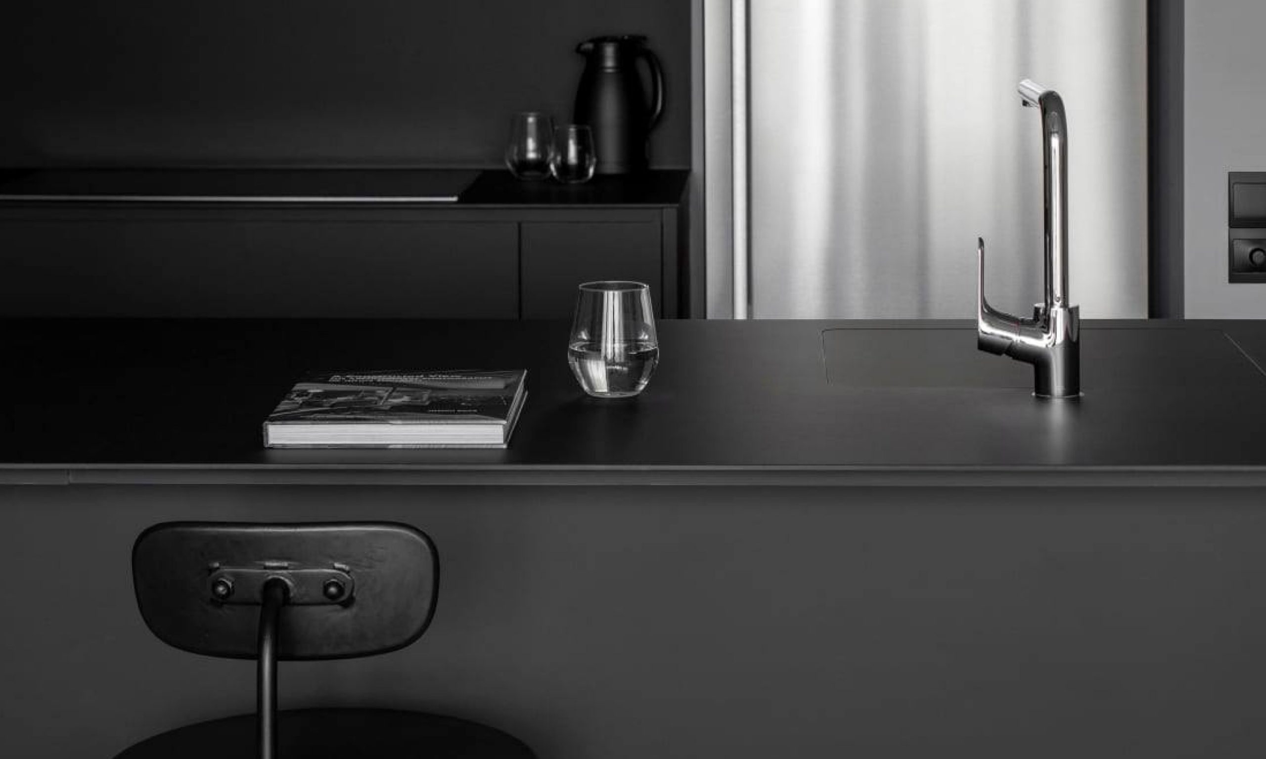
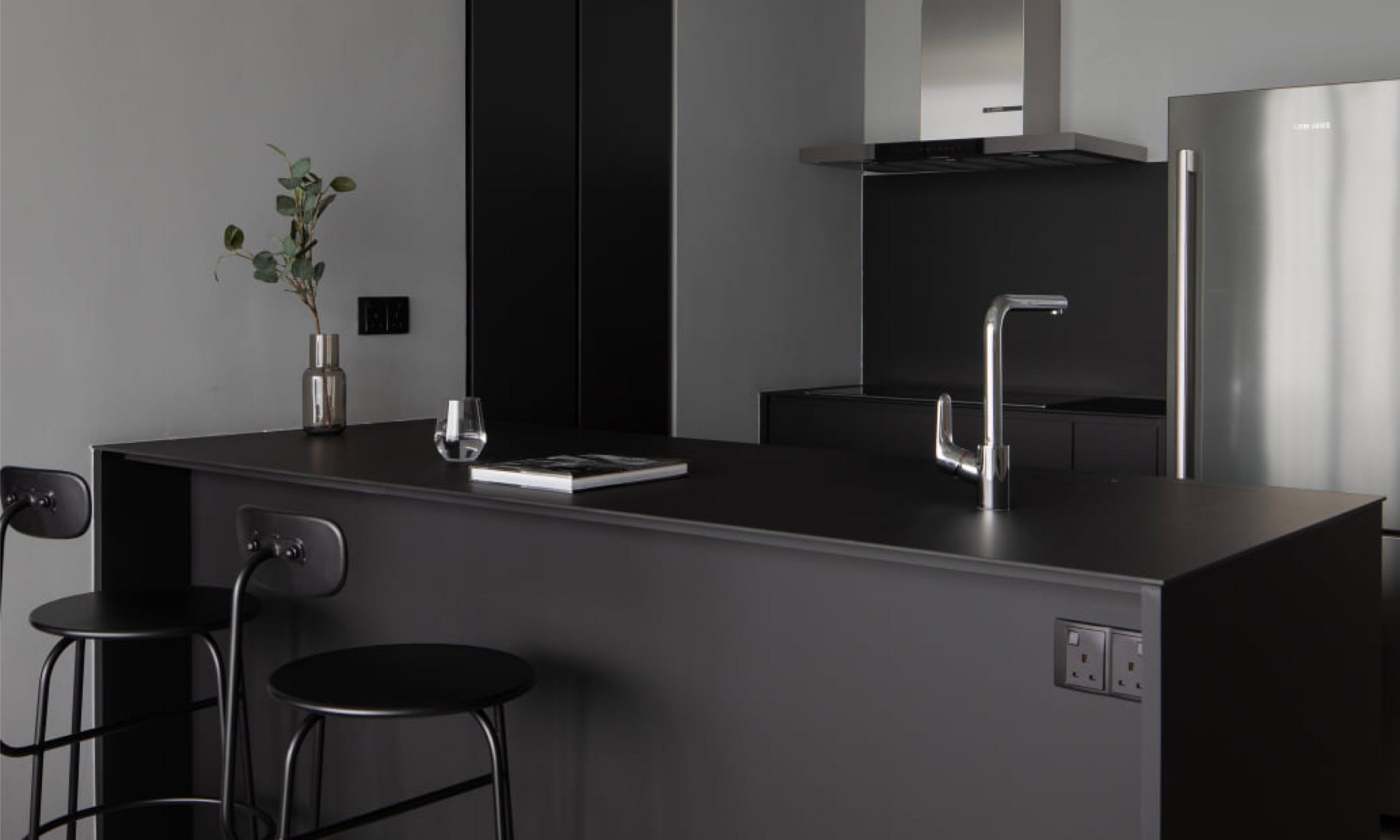
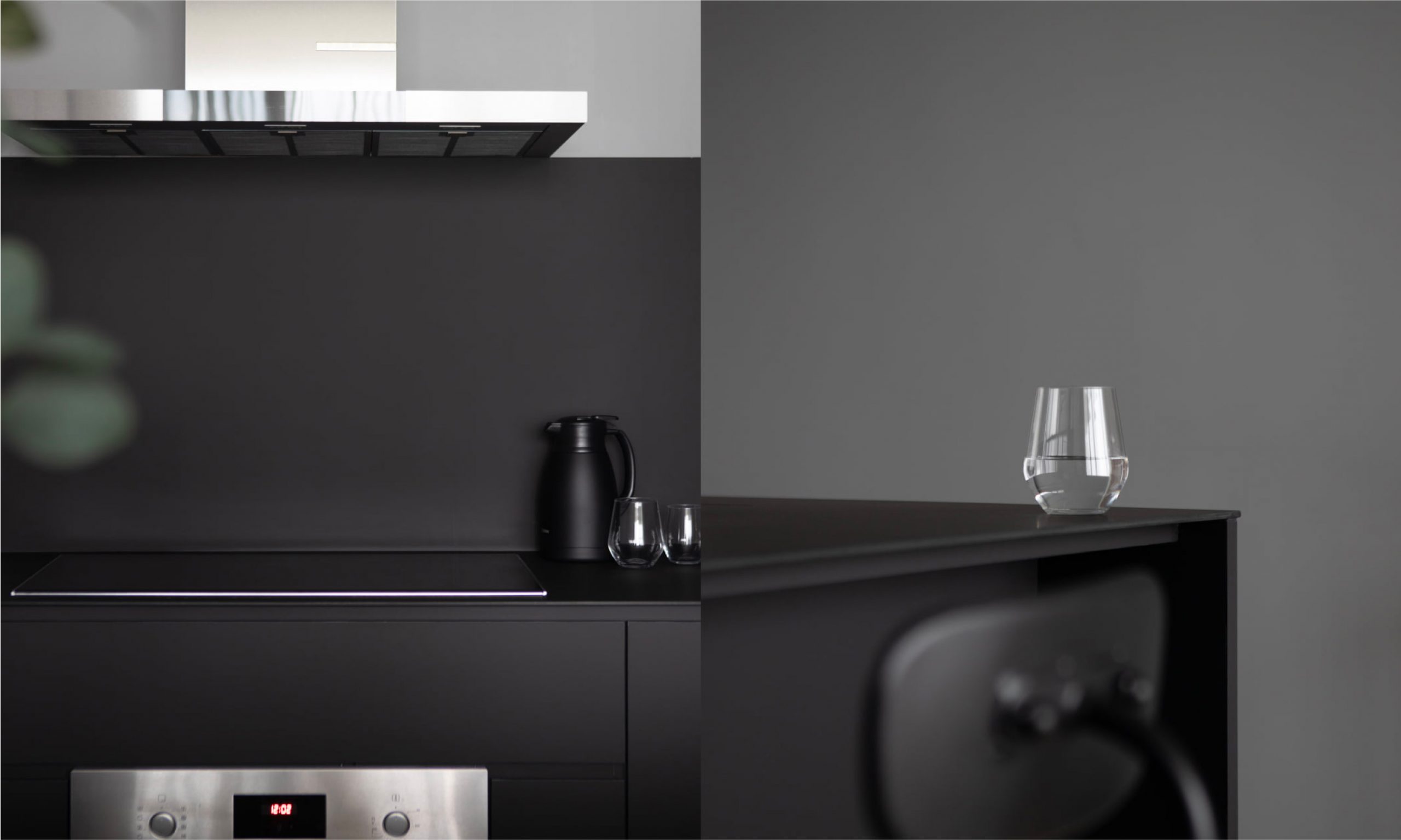
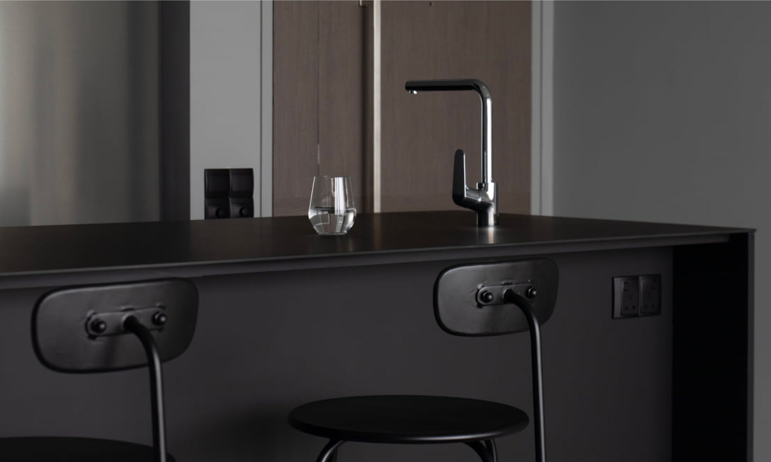
If you haven’t heard, black is steadily becoming the go-to colour for personalising spaces with a different kind of ‘wow’.
Project by @authorsinstyle
KompacTop as Kitchen Countertop + Backer | K1.06 Pure Black | Plains Kollection
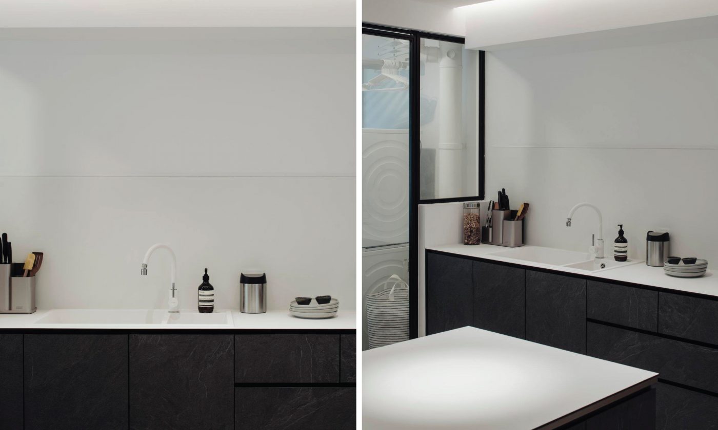
There’s nothing more classic than a black-and-white combination that reminds us of film noirs and oreos.
Project by @_kurokagi_
KompacTop as Kitchen Countertop | K8.01 Grande White | Alta Plains Kollection
Bringing nature home in patterned textures of concrete, stone, and good ol’ wood.
While not every one of us can choose to be surrounded by fresh mountain air and stunning naturescapes, bringing elements of nature home in textured colours from our Woods and Patterns series is the next best alternative to creating a naturally welcoming home that comforts and soothes.
Available in various shades, what our Kollection offers is the enjoyment of natural aesthetics without the necessity of excess bulk to ensure durability.
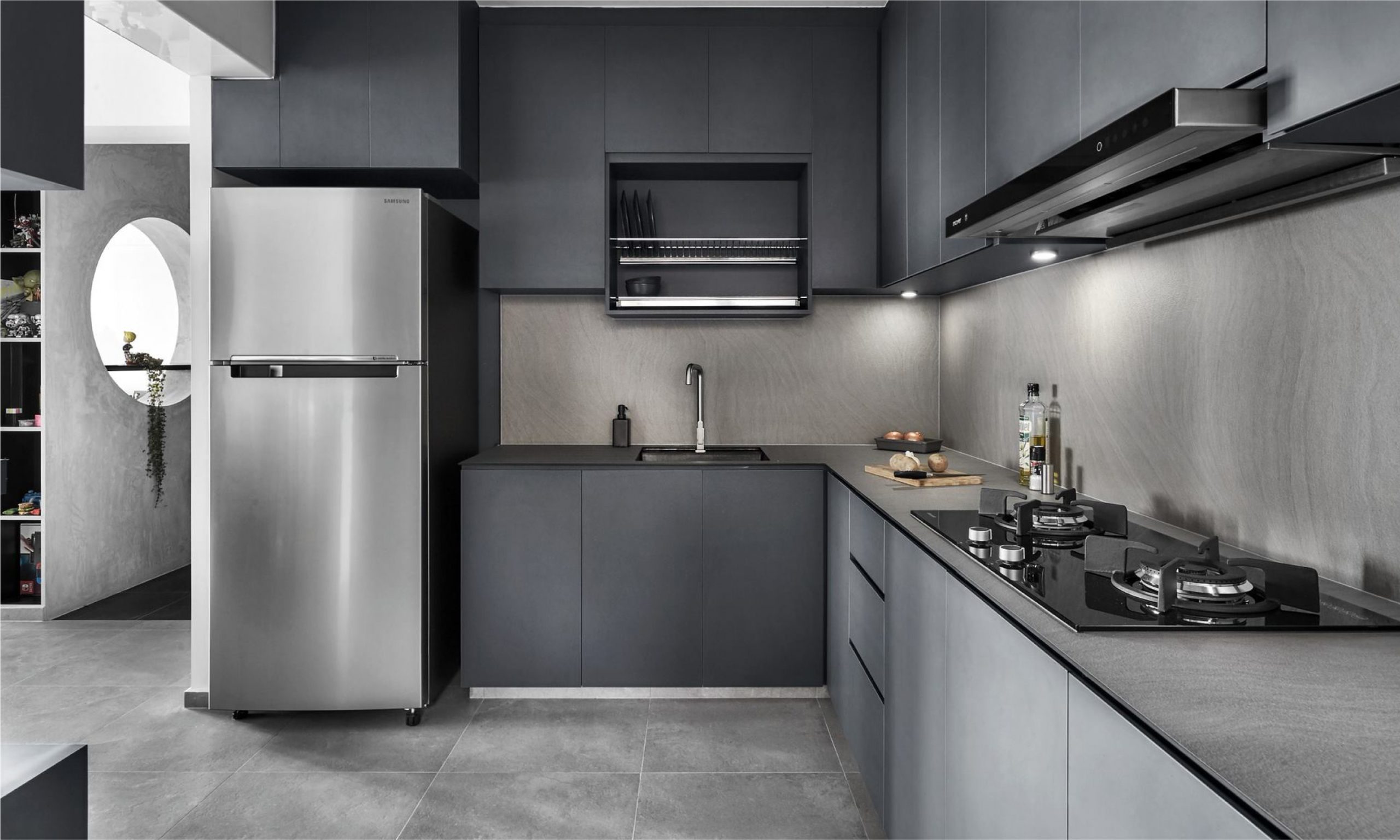
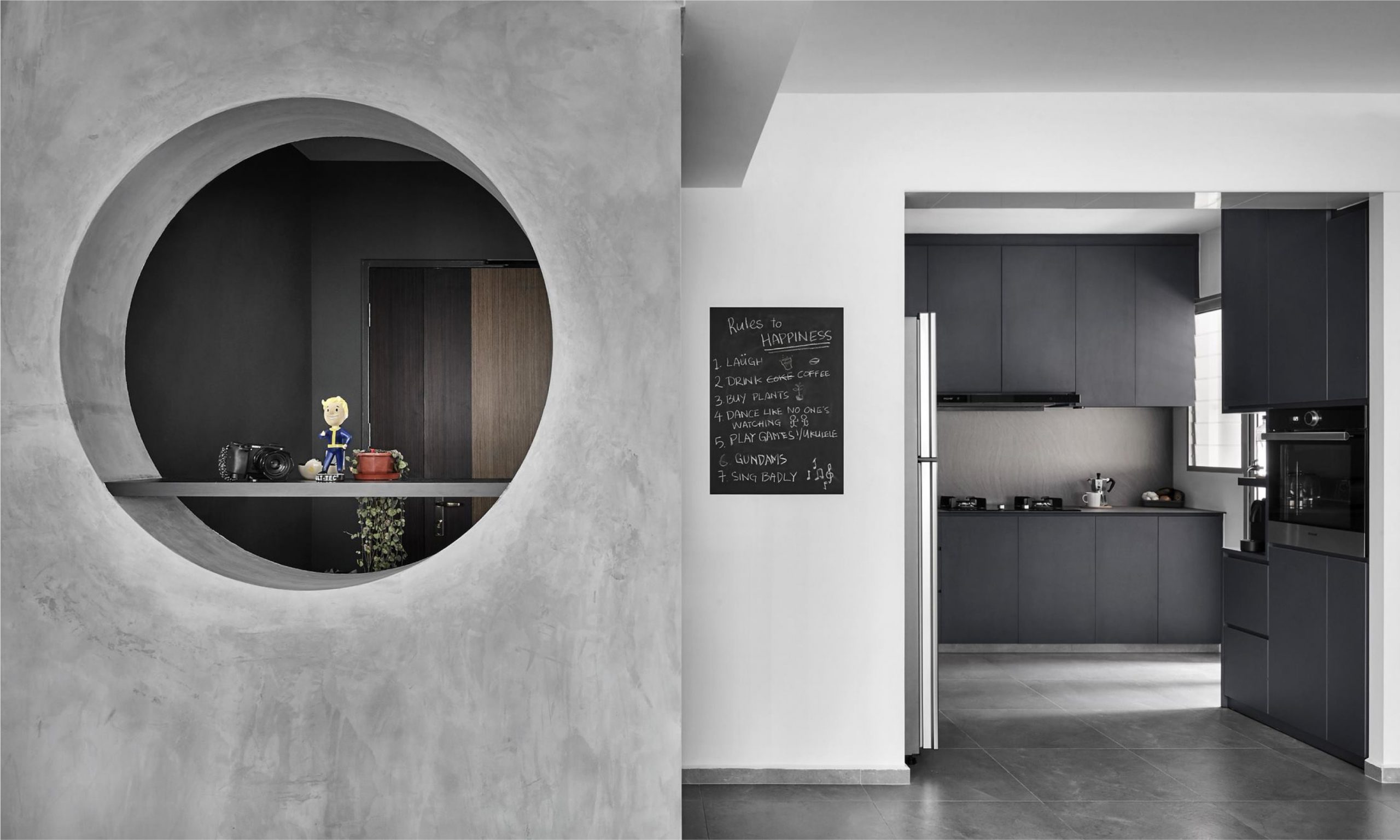
Instead of bare walls, the concrete kitchen backer complements this space beautifully in layers of grey with a touch of steel.
Project by @blend_imc
KompacTop as Kitchen Countertop + Backer | K3.04 Milano Marble | Patterns Kollection
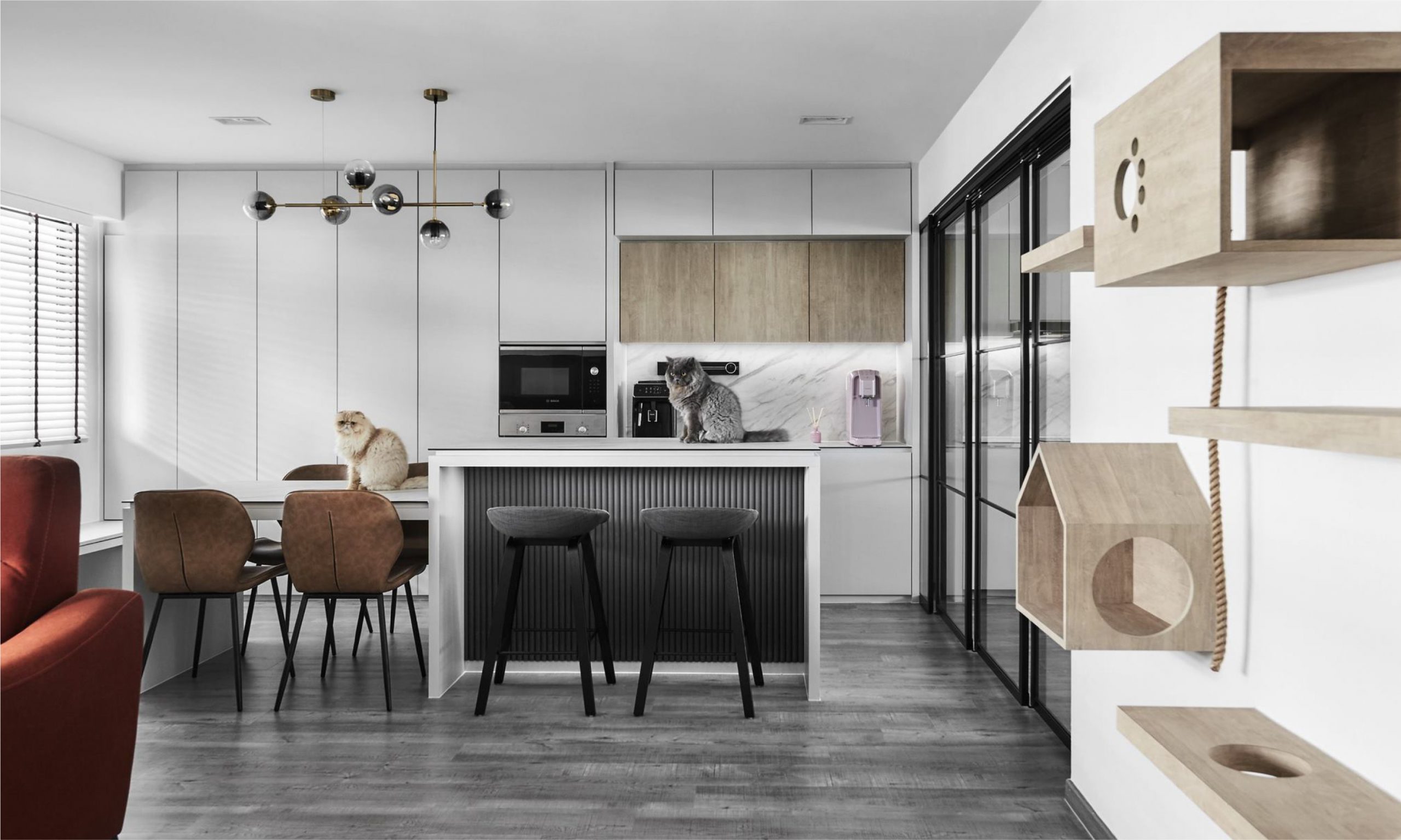
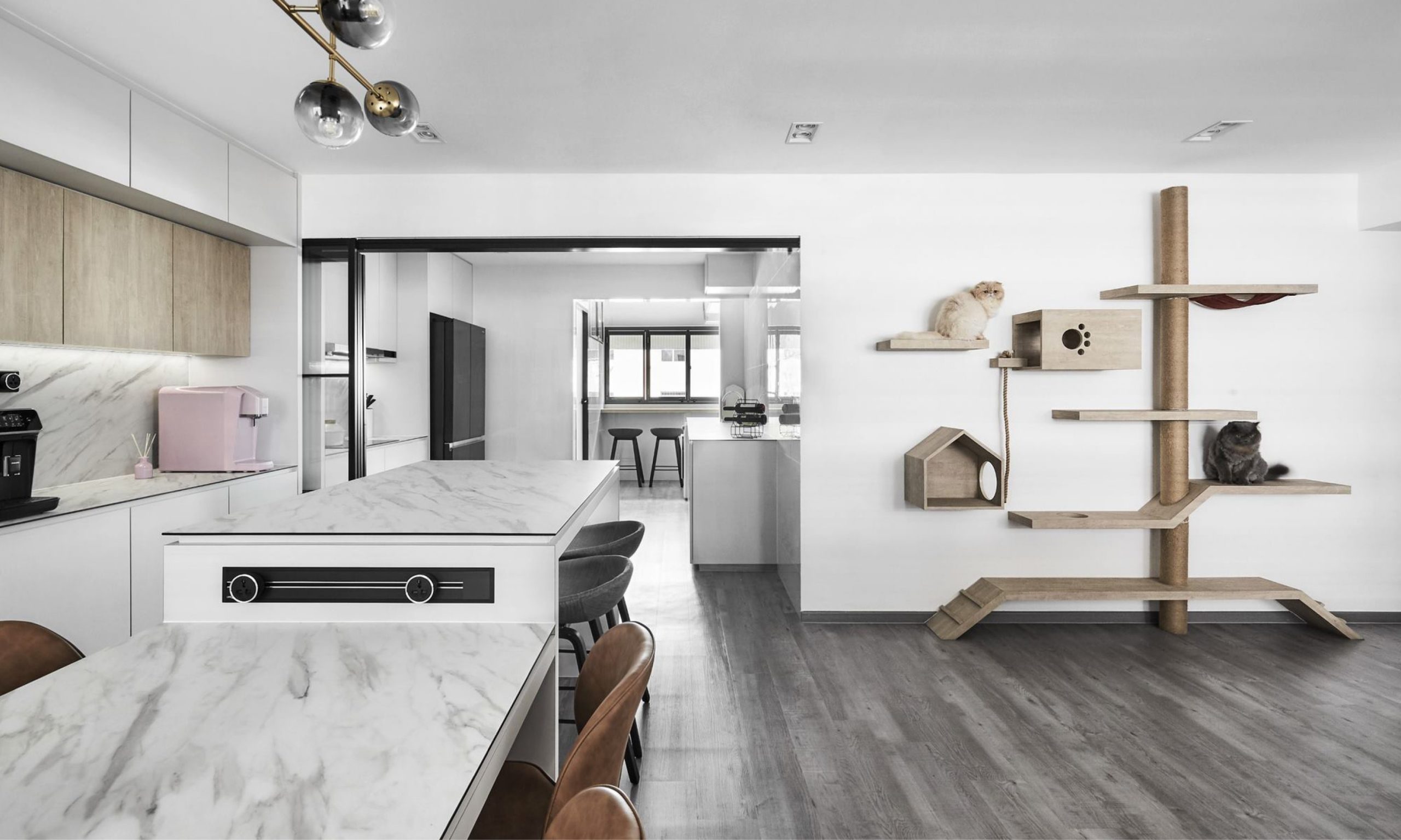
In a space that’s brimming with natural elegance, white marble adds subtle texture to separate storage from function.
Project by @blend_imc
KompacTop as Kitchen Countertop + Backer | K3.01 Bianco Marmo | Patterns Kollection
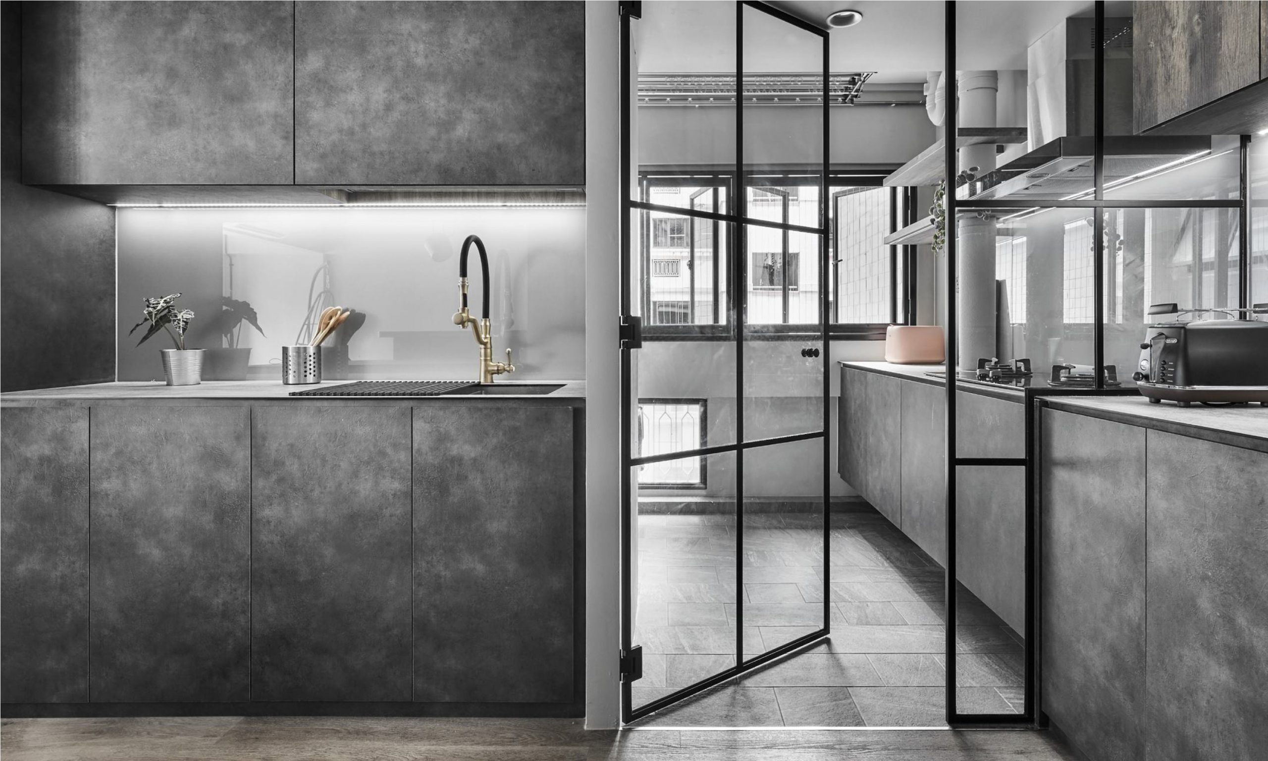
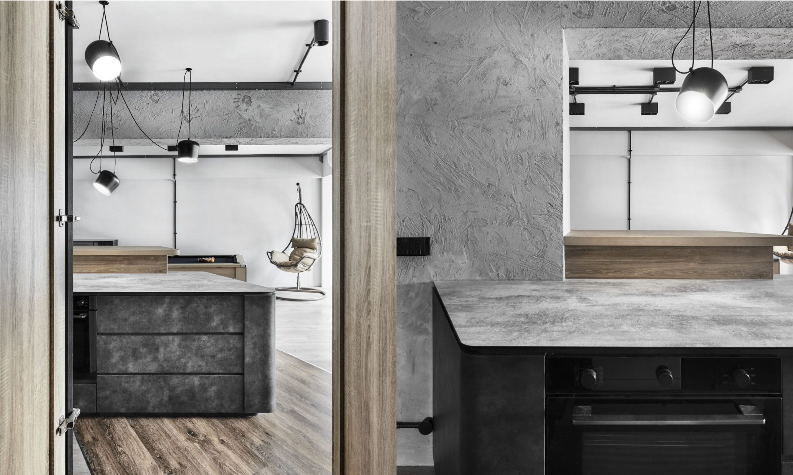
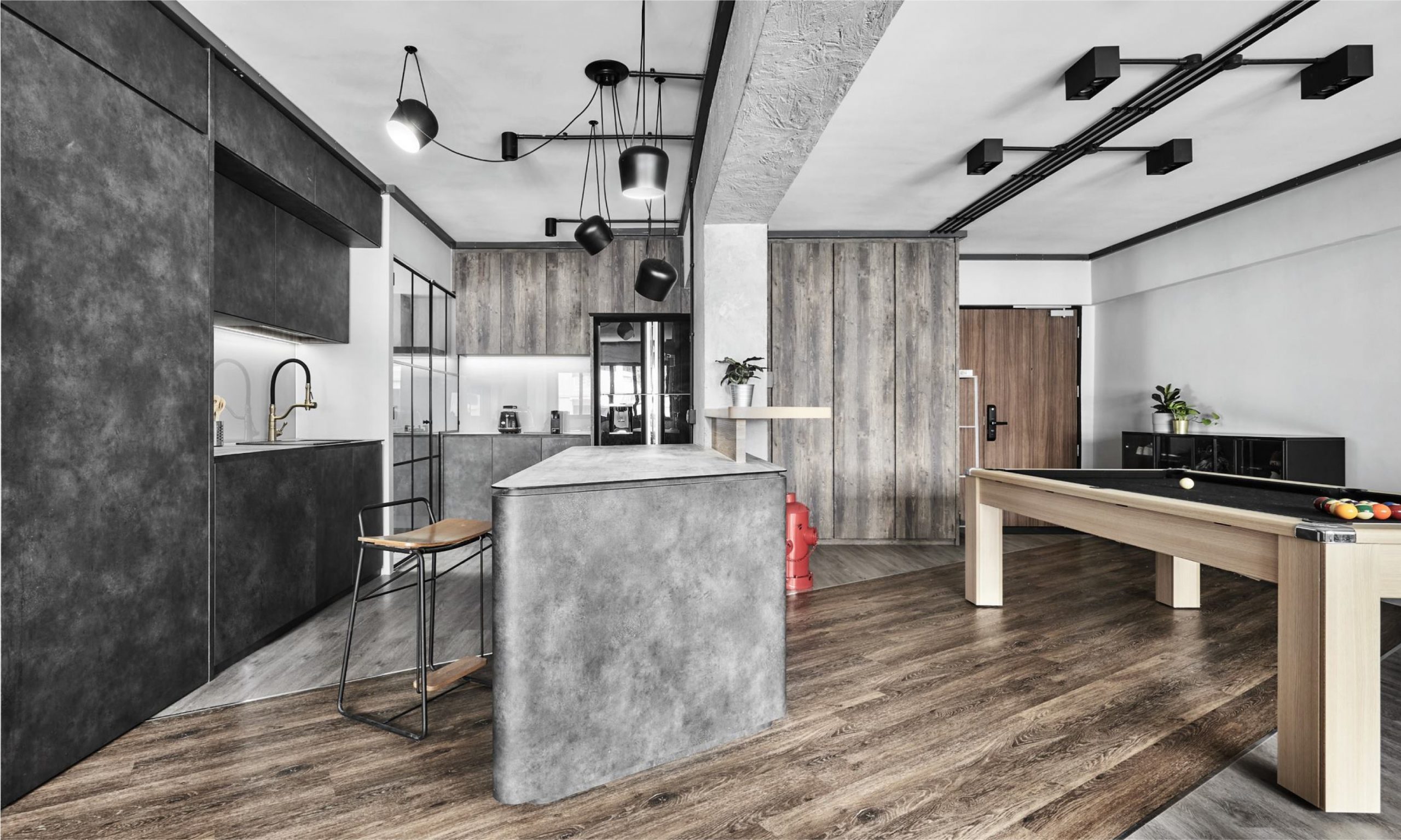
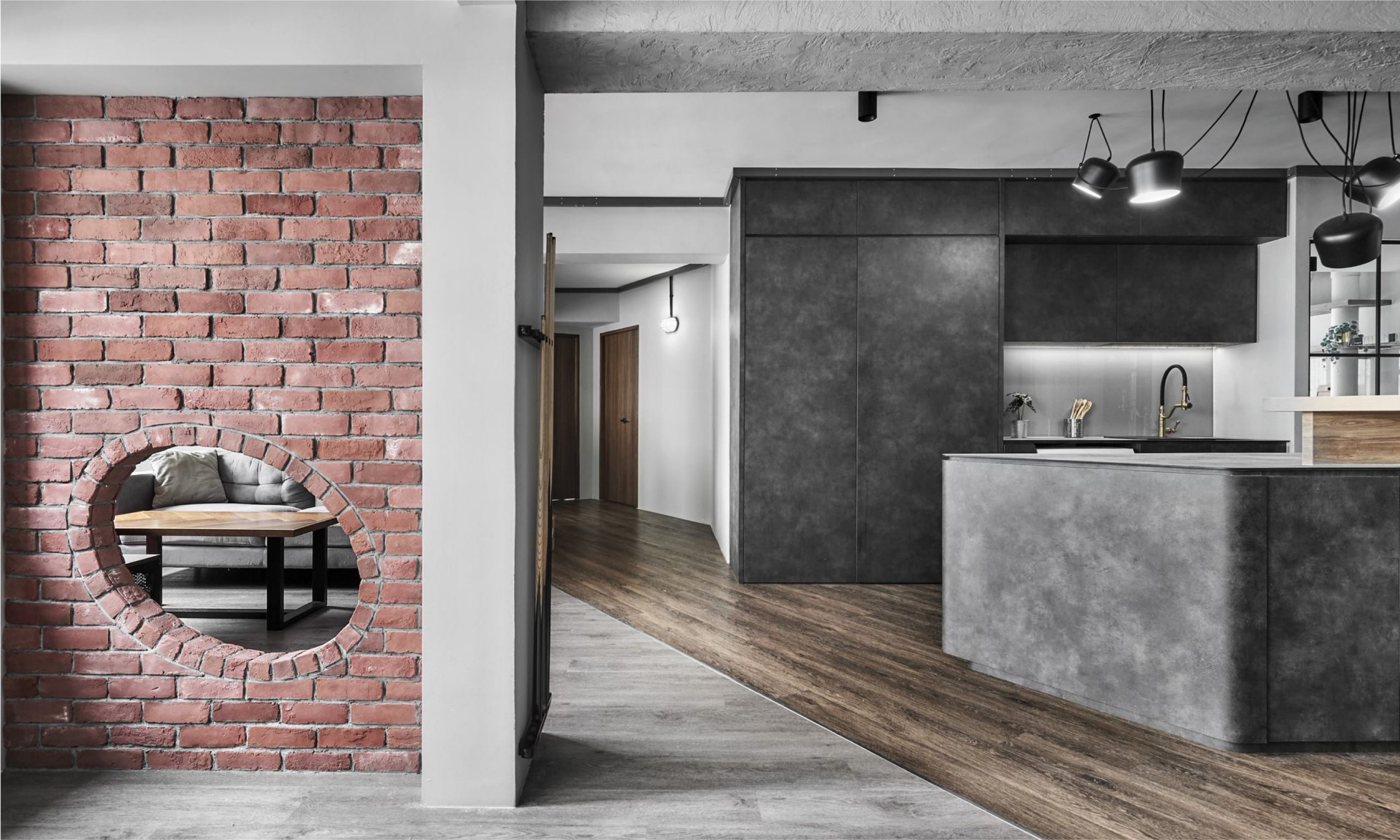
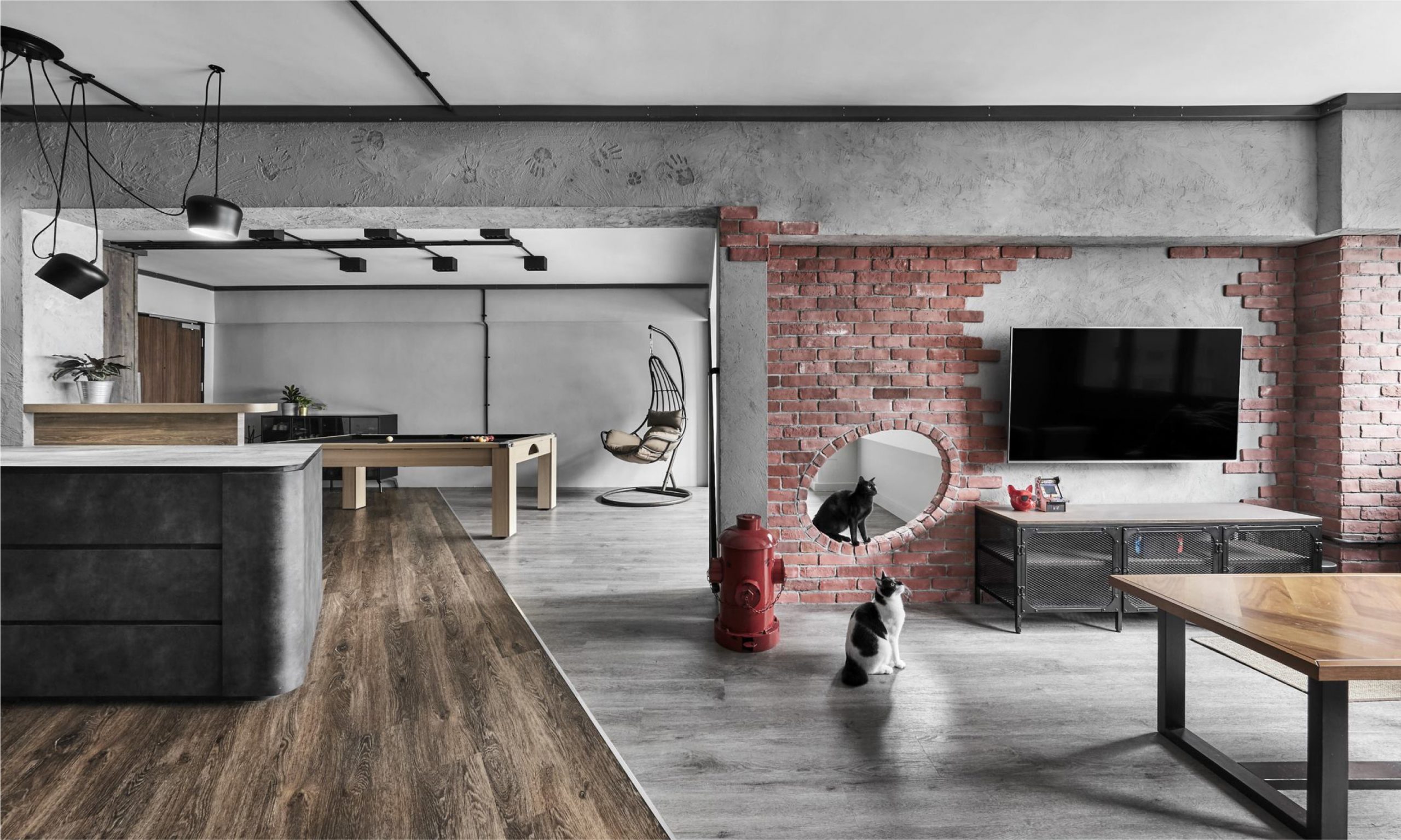
If you’re into the raw and rugged aesthetics, why not consider concrete in assorted grey?
Project by @notionofw
KompacTop as Kitchen Countertop + Backer | K3.02 Varese Concrete | Patterns Kollection
Looking for an upgrade to your space soon? Feel free to get in touch for the best recommendations from our Kollection today.
When it comes to the colour choices for your living space, there are no hard rules to follow as long as the space created can make us feel rested and comfortable in the long run.
Feel free to reach out to us by writing in to enquiry@kompacplus.com.my or contact us at 6842-0335 for immediate assistance from our customer support team.
Don’t forget to follow our brand journey on Facebook and Instagram! For interior ideas and inspiration, look us up on TikTok, Pinterest and Youtube!
Comments are closed.

